During my time at Giggling Squid, I had the opportunity to develop the branding for a Thai street food-inspired Grab & Go concept. The goal was to create something that stood out from the clean-cut and polished competitors like Itsu and Wasabi. We wanted to bring some real personality into the market, something bold, personable and full of character.
The brand is rooted in the founders’ memories of growing up in Thailand in the 70s and 80s. That meant leaning into a rustic, retro feel - taking cues from the vibrant chaos of Thai street food culture and reworking it for a modern, urban audience. We looked to make it feel authentic and a little nostalgic, but still fresh and relevant. This was communicated through the use of bold colours, slightly worn textures, playful typography, and quirky illustrations that feel handcrafted and full of charm.
Our target audience was a group we called the ‘mid-week lunchers’ who are mostly younger customers in commuter towns and cities. They’re students or early-career professionals who love ethical, fresh food and are big on convenience. So, the brand needed to reflect those preferences while still keeping things exciting and fresh.
Everything from the logo to the packaging was designed with these people in mind. We developed a brand identity that’s bright, bold, and confidently standing apart from the more minimal, polished designs in the market. This was all about showing how design can connect with people, and add some personality to the Grab & Go market.
Giggling Squid is the UK’s largest Thai restaurant chain, and from October 2021 to July 2023, I was their first ever in-house designer. During this time, I was solely responsible for designing all of the brand’s print and digital assets, and I played a key role in elevating the brands visual identity.
Before I joined, the brand’s creative assets were inconsistent and didn’t reflect its premium market position. I led a comprehensive visual refresh to bring everything in line - from tone and layout to colour, typography, and the use of illustrations. The result was a more cohesive, polished identity that better aligned with the Giggling Squid experience.
As part of the refresh, I produced new brand guidelines to ensure consistency moving forward. These included clear usage rules for the logo, illustrations, and typography, as well as step-by-step instructions for updating existing materials across both print and digital. This laid the foundation for a more efficient and professional design process across the business.
I designed everything from in-restaurant POS, flyers, and menus to email marketing, adverts, and social campaigns. Whether it was a seasonal promotion or a new store opening, I made sure each piece felt unmistakably Giggling Squid - vibrant, playful, and premium.
Some examples of this work are shown on this page, offering a glimpse into how the refreshed branding came to life across multiple touchpoints.
Springboard UK and The Springboard Charity are two distinct but closely linked organisations, working together to champion careers in hospitality and support unemployed individuals into meaningful work.
In March 2020, I led and delivered a full rebrand of Springboard—a transformation that was long overdue. The previous branding, unchanged since 1999, was outdated, inconsistent, and failed to reflect the energy and purpose of the organisation. As a result, Springboard often struggled to stand out in a competitive sector, limiting its potential for growth and recognition.
The goal was to create a brand that felt modern, vibrant, and aligned with Springboard’s mission - while also offering a cohesive system for its 12 sub-brands. The new identity built on the legacy of the original brand but evolves it into something more confident, consistent, and impactful. It still remained recongnisable but had a fresh new look and is also now flexible enough to resonate with a range of audiences, from jobseekers and students to hospitality leaders and corporate partners.
The rebrand included a fresh colour palette inspired by optimism and progress, modern typography, and a set of graphic elements- such as rounded shapes and geometric circles; this unifies all the brand extensions under one clear visual identity, while still allowing sub-brands to have their own distinct feel.
I oversaw the rollout across all touchpoints, from print and digital marketing materials to a new suite of WordPress templates used across three websites. Comprehensive brand guidelines were also created to ensure brand standards and consistency going forward.
This was one of the largest and most rewarding projects of my career. Not only did it bring clarity and energy to Springboard’s brand, but it also contributed to a record financial performance in 2020–2021, despite the challenges of the pandemic.
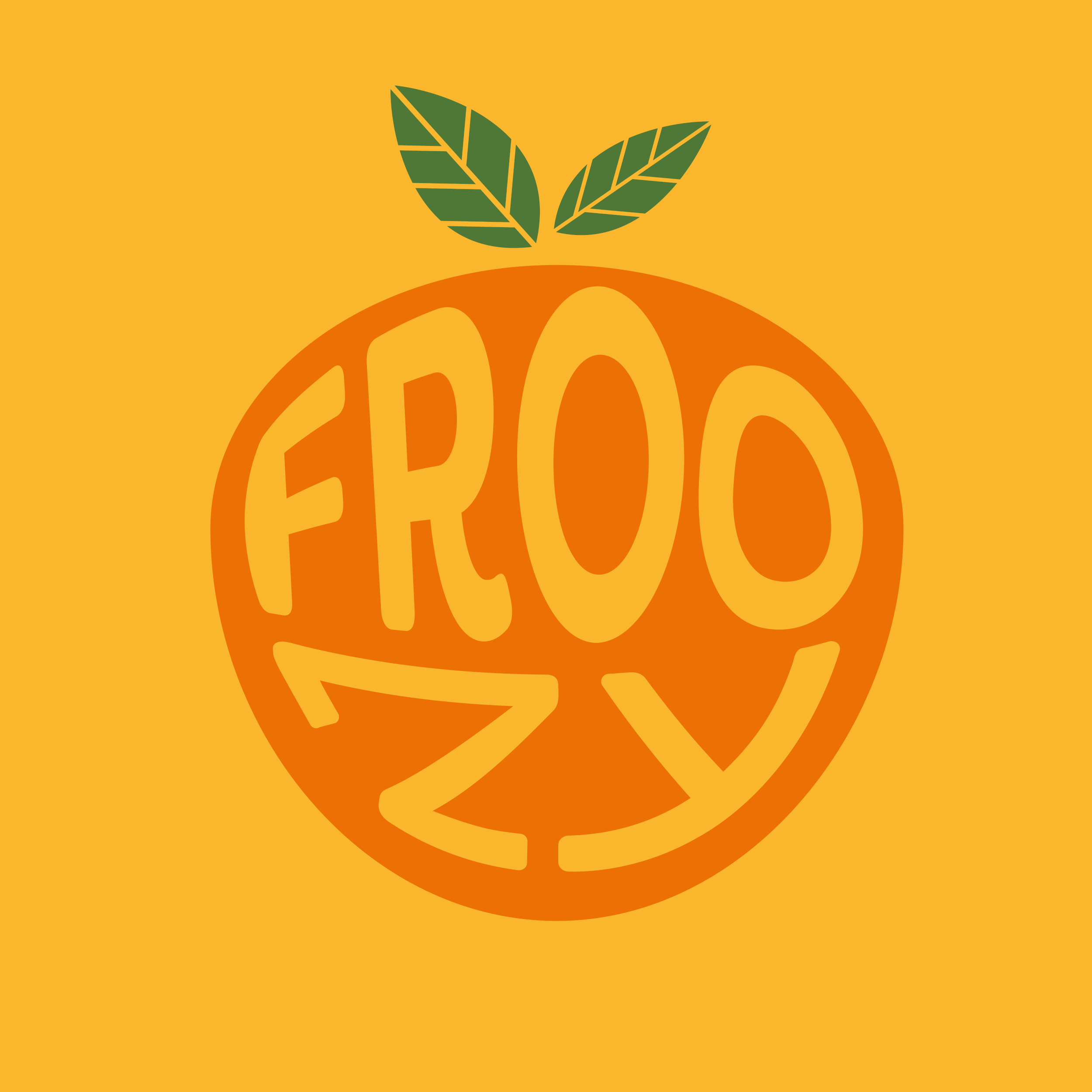
Branding concept for Froozy, a vibrant new smoothie and juice brand, covering everything from the logo and e-commerce website to product packaging, animations, social media visuals, and business cards.
The visual identity was designed to be as energetic and fresh as the product itself. The brand colours - orange, green, and white were inspired by the natural hues of fruit, creating a look that’s bright, playful, and instantly appealing. This palette, combined with dynamic illustrations, gives Froozy a fun, organic feel that stands out both on screen and on shelf.
At the heart of the brand is a bold, lively logo that captures the essence of blending fruit - fluid, full of movement, and packed with personality. The supporting illustrations of fruit elements were created in a hand-drawn, approachable style, helping to reinforce the brand’s natural, feel-good message.
Every visual asset was designed to be flexible and flavour-forward, allowing Froozy to easily showcase different smoothie blends and seasonal variations. Whether on packaging, social media, or digital platforms, the identity remains consistent, colourful, and full of life.
Brand identity, e-commerce website, animations, stall signage, and business cards for the hugely popular baked goods stall, Jack’s Bakery.
With all cakes handmade using Jack’s original recipes, the brand’s personality is rooted to its founder. Jack himself is the heart of the business as it is his charm and character are what draw people in. That led to the idea of turning Jack into a brand mascot. His distinctive beard became the centerpiece of the logo, transforming him into The Bearded Baker, a playful and memorable identity that customers instantly connect with.
To reflect the handmade, organic nature of the bakery, the fonts and design elements were chosen to feel warm, tactile, and personable. The bold blue and white colour palette was selected to be fresh, eye-catching, and to stand out both on market stalls and online platforms.
I also created a set of hand-drawn icons to represent each product category, tying in with the overall crafted, homemade aesthetic. Whether someone’s browsing the website or walking past the stall, every touchpoint feels cohesive, bold and personable.
Lime Squeezy – Brand Collateral & Creative Projects
Lime Squeezy is the sister brand of Giggling Squid, created to offer a more relaxed, casual dining experience with iconic South East Asian dishes served fresh and fast. Originally launched as a restaurant chain, Lime Squeezy has since evolved into a delivery-only concept.
As part of my role at Giggling Squid, I was responsible for designing all digital and print assets for Lime Squeezy as well. This included everything from A-boards and flyers to menus, animations, and social content. My focus was keeping the brand’s bold, youthful energy front and centre, ensuring everything feels bright, friendly, and full of personality.
Lime Squeezy Kids Menu
One of my favourite projects was designing the double-sided A3 kids menu. The brief was to create something interactive and entertaining to keep little diners happy while they wait. I developed all the games, illustrations, and characters from scratch, making sure the design was as engaging as it was on-brand.
The menu includes a mix of fun activities - a maths-themed crossword, wordsearch, maze, and plenty of space for colouring in. The overall look is playful, vibrant, and easy for kids to navigate, whilst still feeling cohesive with Lime Squeezy’s brand.