Froozy Smoothie & Juice Brand Identity
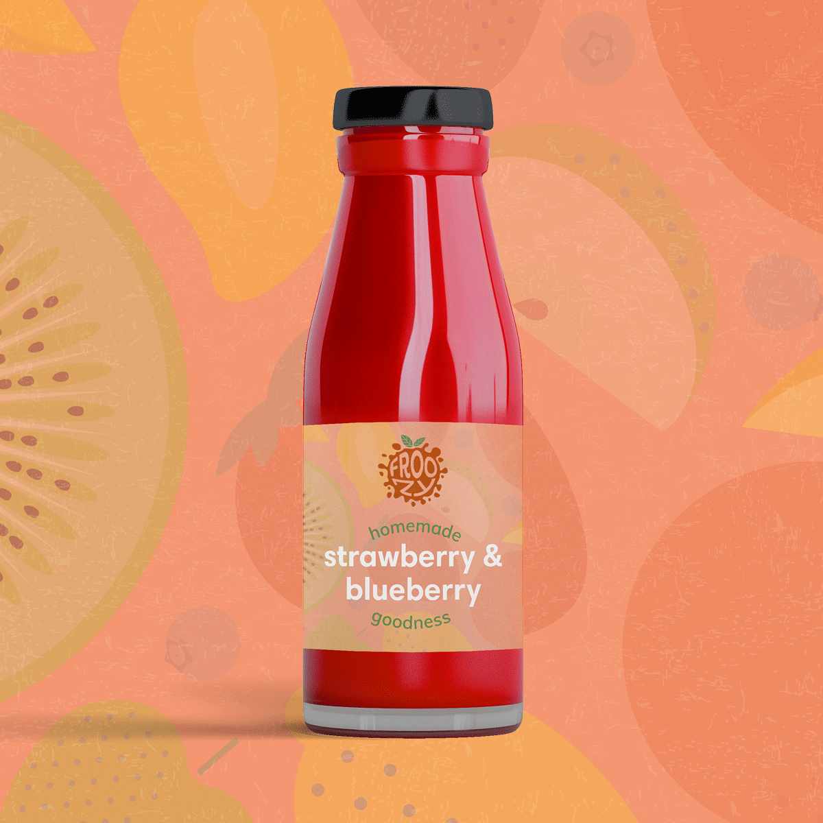
Branding concept for new smoothie and juice brand, Froozy - including designs for a logo, e-commerce website, product packaging, animation, social media images and business card.
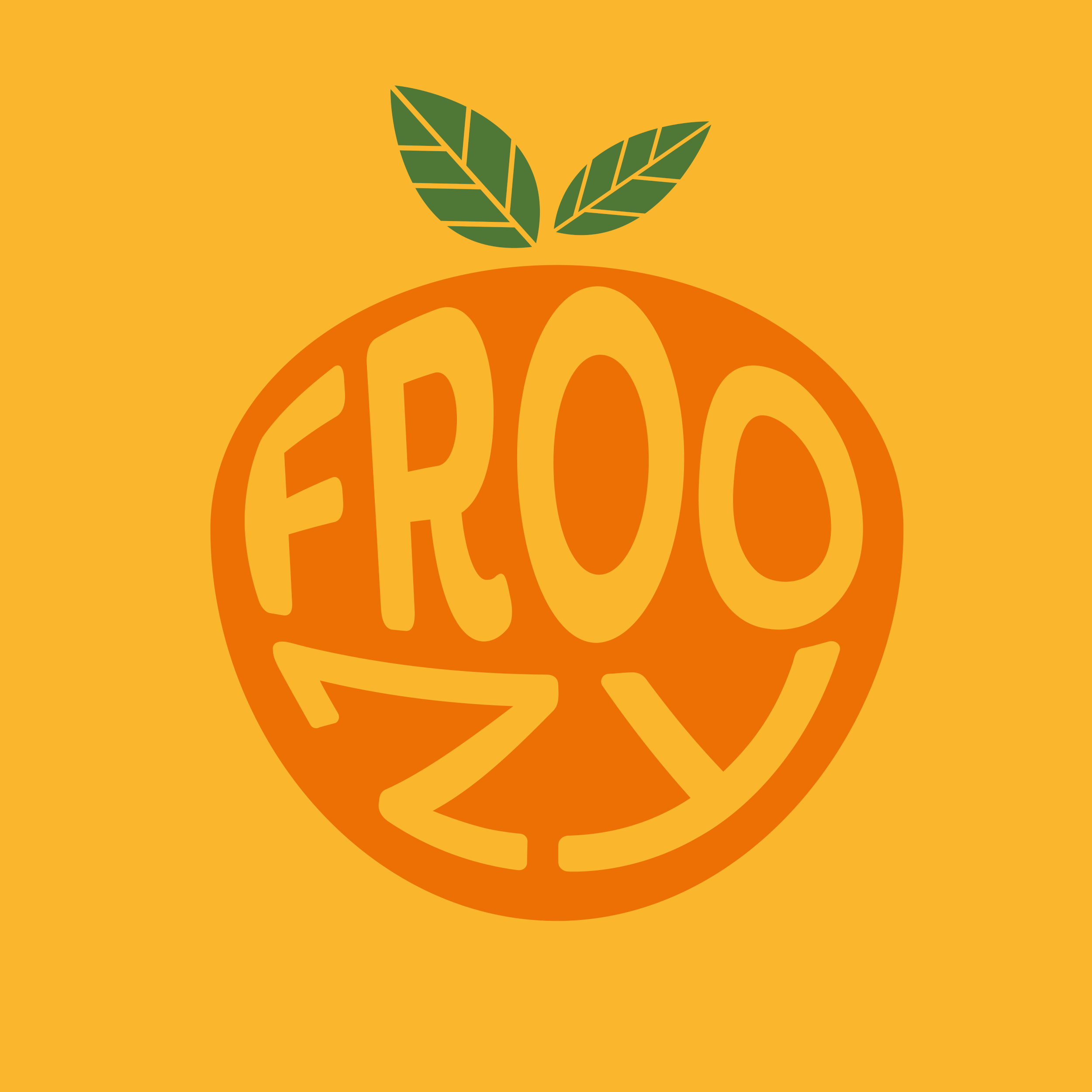
The brand colours and illustrations are designed to be bright, eye-catching and dynamic with a lively logo to represent the blending of the fruit. The main colour palette of orange, green and white is inspired by the natural colouring of fruit. It’s fun, friendly and flexible to showcase Froozy’s different flavours. The style of additional fruit illustrations helps give the brand an organic feel and is versatile enough to be adapted across all visual assets.


Animation music: www.bensound.com