


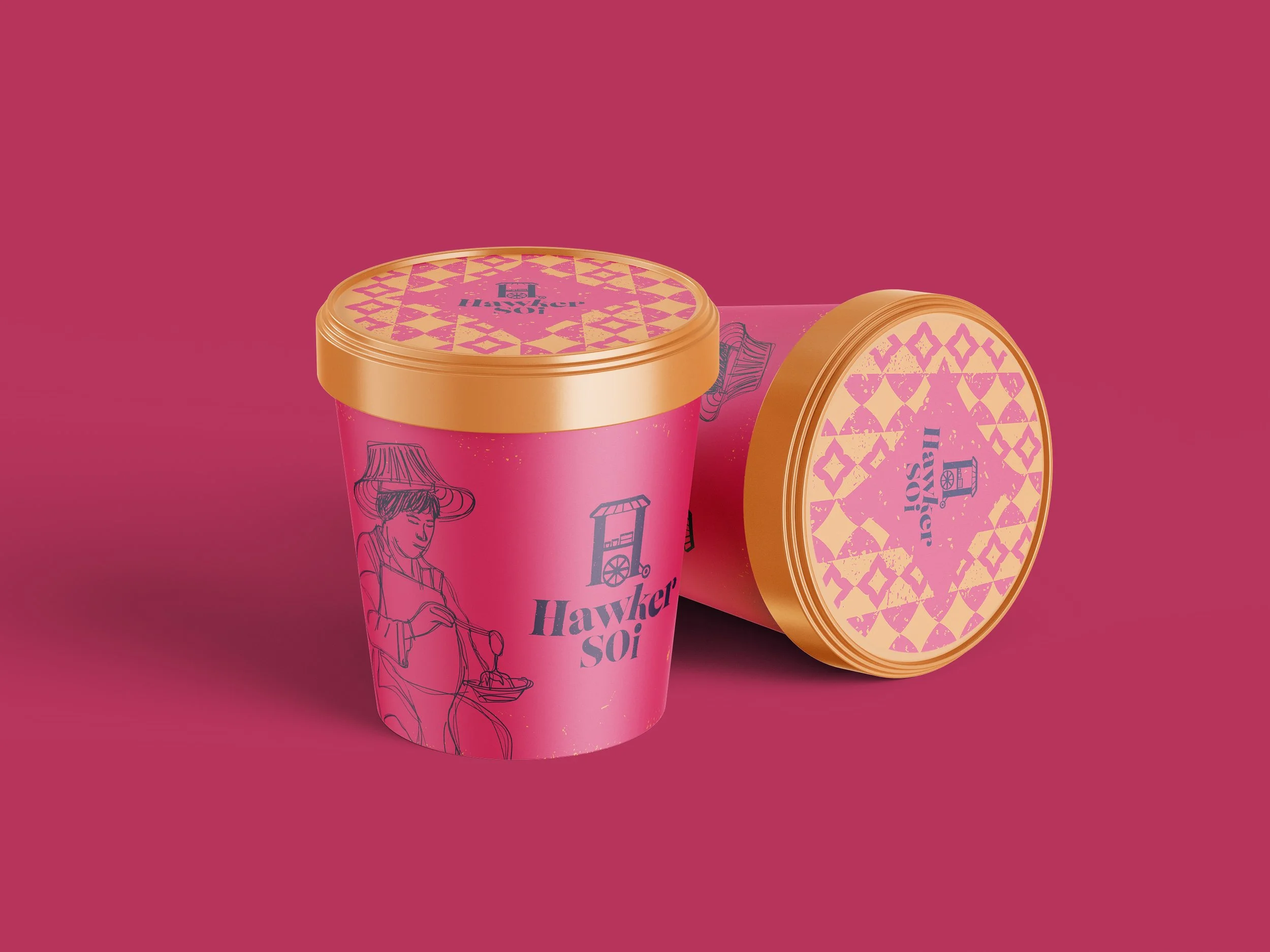


During my time at Giggling Squid, I had the opportunity to develop the branding for a Thai street food-inspired Grab & Go concept. The goal was to create something that stood out from the clean-cut and polished competitors like Itsu and Wasabi. We wanted to bring some real personality into the market, something bold, personable and full of character.
The brand is rooted in the founders’ memories of growing up in Thailand in the 70s and 80s. That meant leaning into a rustic, retro feel - taking cues from the vibrant chaos of Thai street food culture and reworking it for a modern, urban audience. We looked to make it feel authentic and a little nostalgic, but still fresh and relevant. This was communicated through the use of bold colours, slightly worn textures, playful typography, and quirky illustrations that feel handcrafted and full of charm.
Our target audience was a group we called the ‘mid-week lunchers’ who are mostly younger customers in commuter towns and cities. They’re students or early-career professionals who love ethical, fresh food and are big on convenience. So, the brand needed to reflect those preferences while still keeping things exciting and fresh.
Everything from the logo to the packaging was designed with these people in mind. We developed a brand identity that’s bright, bold, and confidently standing apart from the more minimal, polished designs in the market. This was all about showing how design can connect with people, and add some personality to the Grab & Go market.