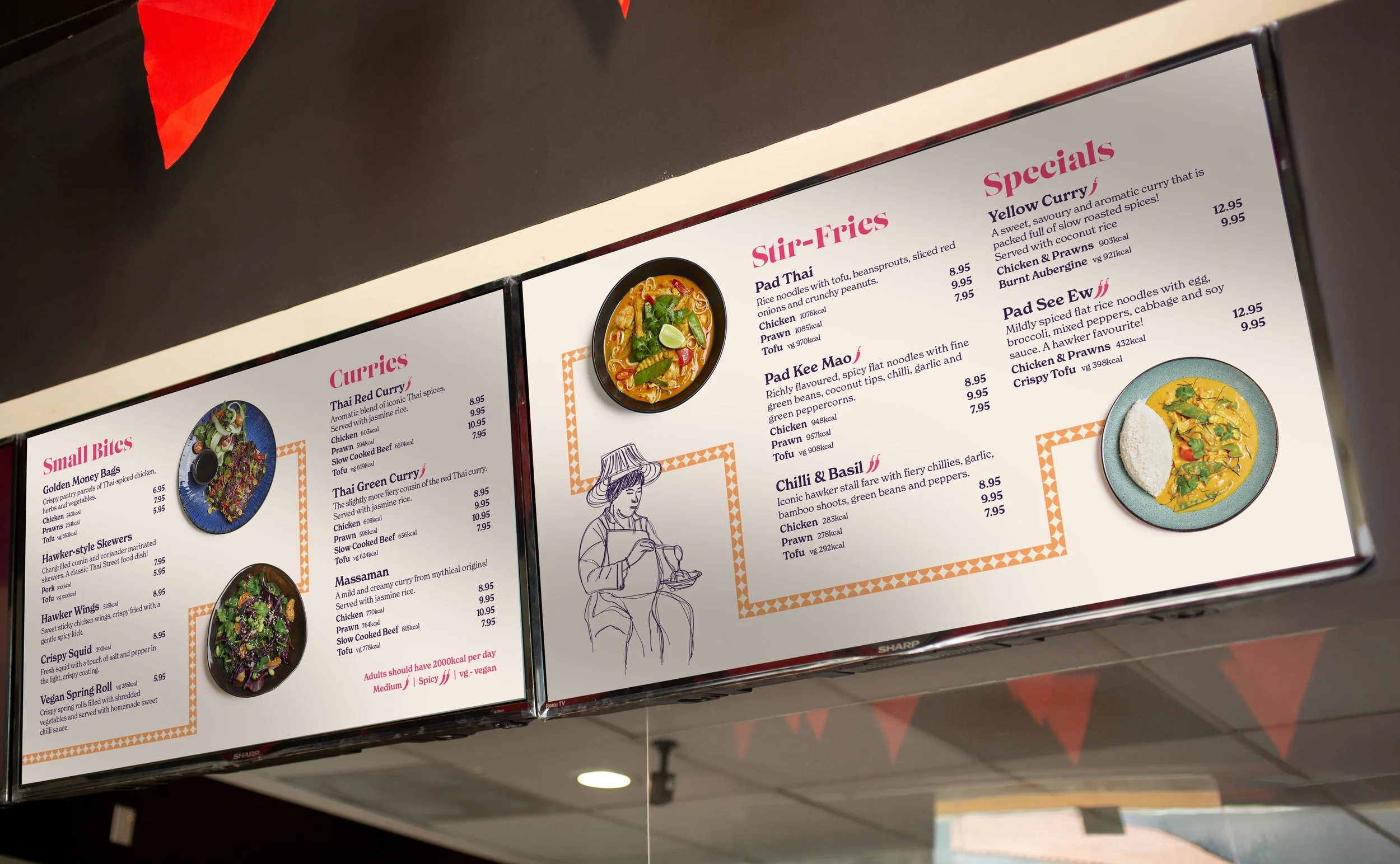
Hawker Soi Grab & Go Brand Concept
During my time at Giggling Squid, I had the opportunity to develop the branding for Hawker Soi, a Thai-inspired Grab & Go concept. The goal was to bring something fresh and distinctive to a market that often leans towards a more clean-cut aesthetic, creating a vibrant identity full of colour, energy, and personality.
Hawker Soi was designed for high-footfall towns and smaller cities, targeting a younger, health-conscious audience already engaged with Grab & Go brands. The offering focuses on fast, healthier meals with strong vegetarian appeal, providing a convenient option for busy workdays and on-the-go lunches.


Design Process
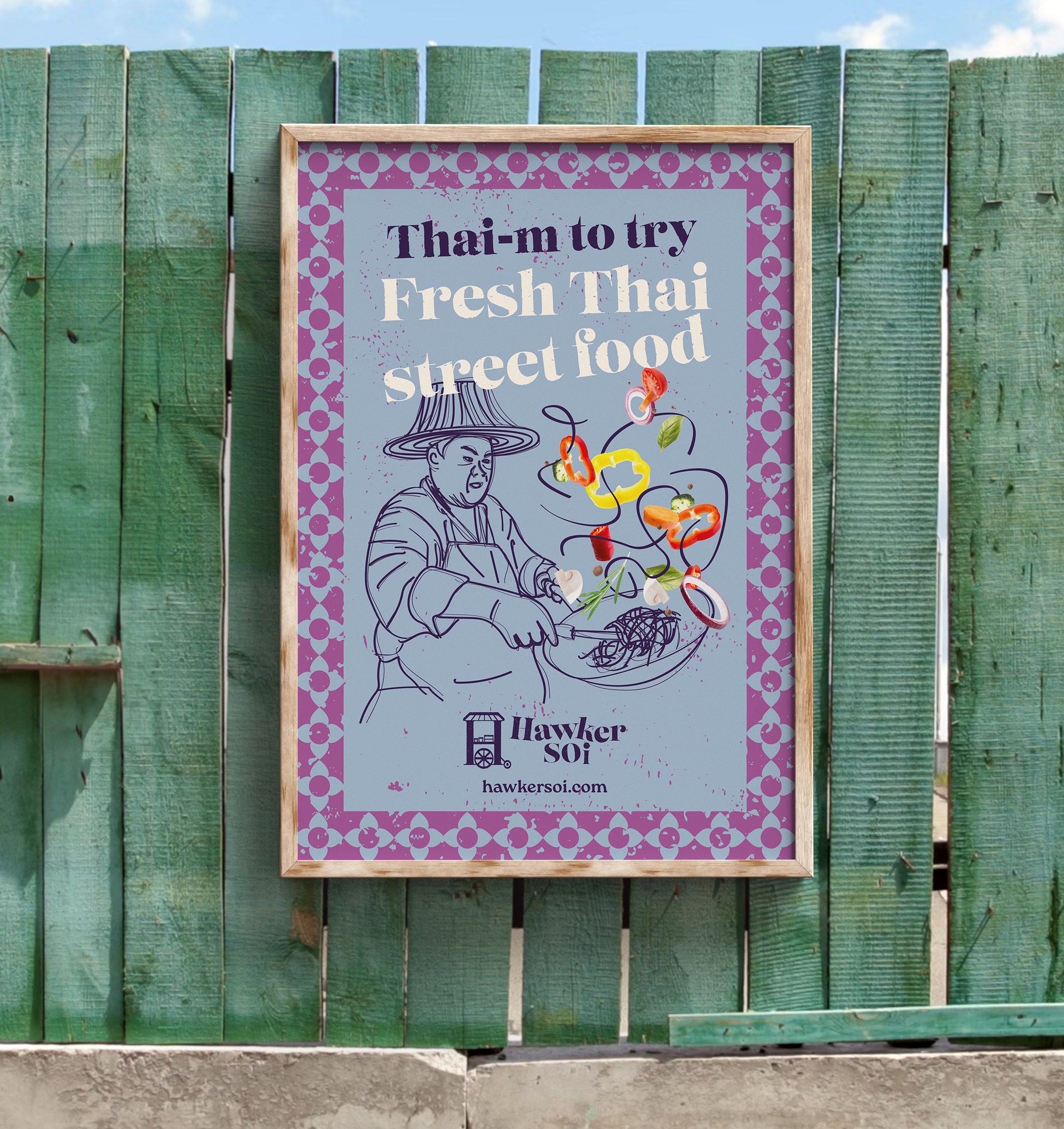
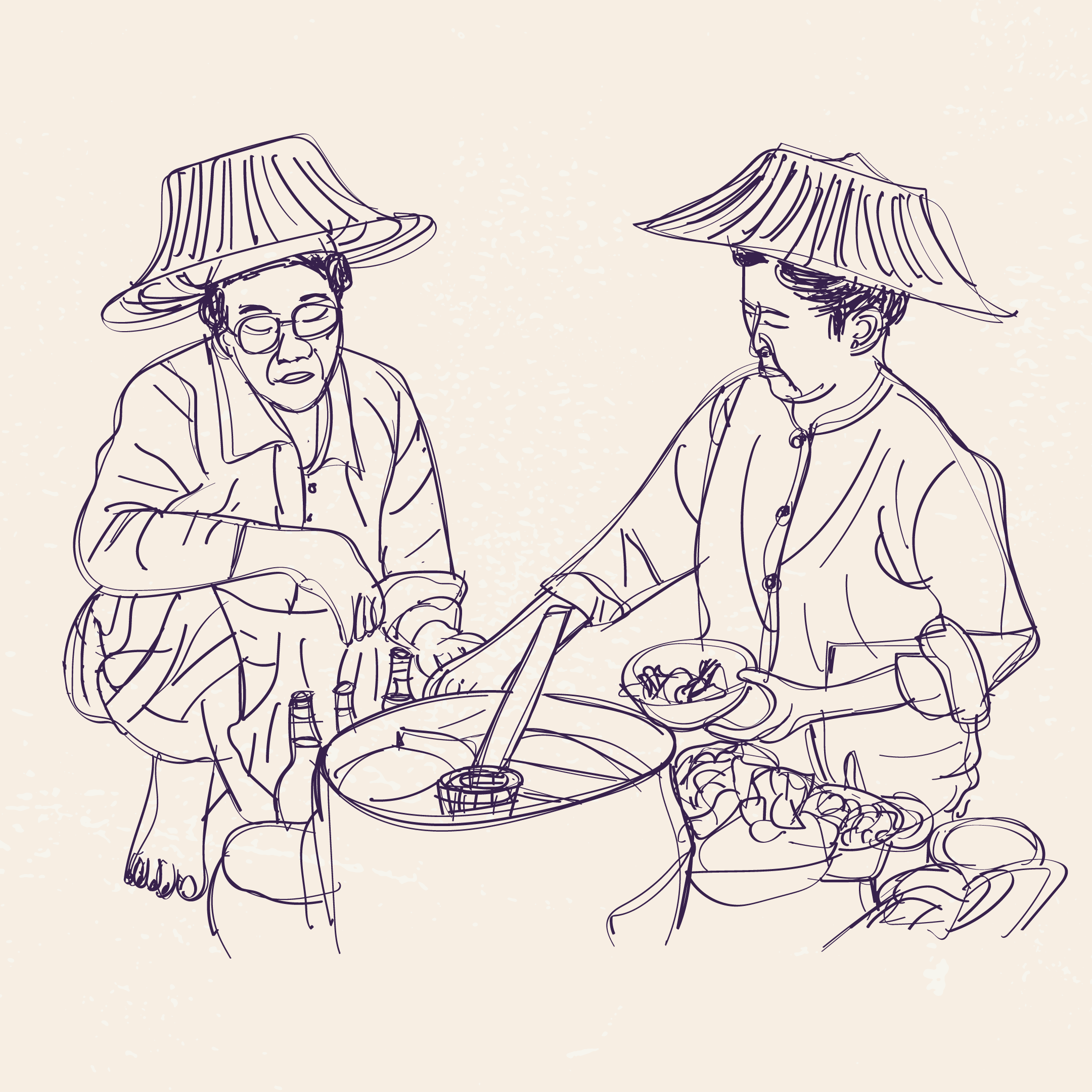
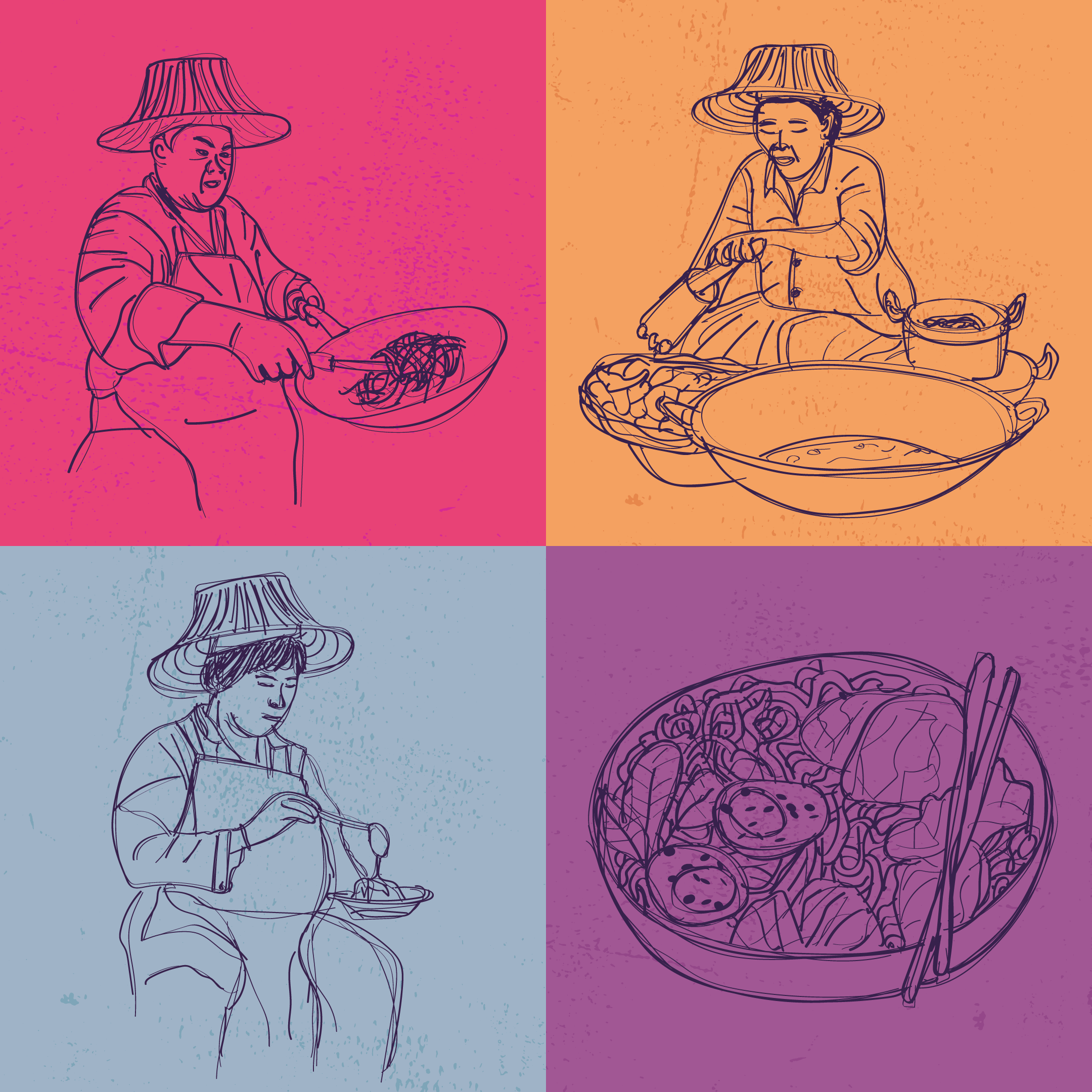
The concept was inspired by the founders’ memories growing up with the lively, fast-paced lunch culture found across Asia. ‘Hawkers’ - the street food vendors synonymous with bustling Asian markets - became central to the brand identity and were brought to life through traditional Thai art-inspired ink illustrations. These expressive characters helped communicate the warmth, authenticity, and personal touch behind the brand.
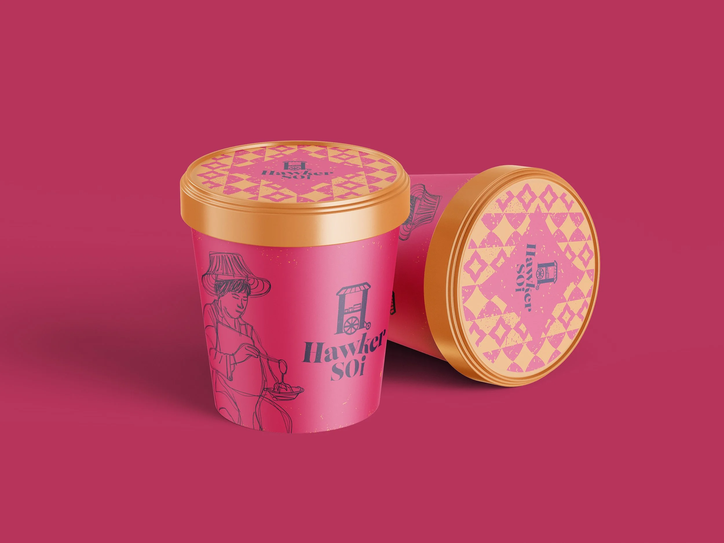
Every touchpoint was carefully considered to ensure the brand not only stood out in a crowded market but also connected with its audience on a deeper level. Vibrant colours and dynamic motion ingredients captured the energy of Thai street food culture, while handcrafted patterns and Thai-inspired illustrations add authenticity and character. Textured finishes introduce a rustic edge, balanced by confident serif typography that reflects the quality of the food offering.
The goal was to create more than just a visual identity - it was about building a brand experience where the quality of the food attracts customers and the vibrancy, storytelling, and human personality of the brand keeps them coming back.