The Light Cinema
The Light is a rapidly growing cinema and leisure brand that has evolved from a cinema chain into a multi-experience entertainment destination. Working on the cinema side of the business, I had the opportunity to create a wide range of engaging and creative campaigns across print and digital.
This page showcases a selection of campaigns that combine engaging visual storytelling with impactful design, creating memorable experiences that connect with audiences and encourage them to visit.
Responsibilities
Creative Direction, Illustration, Print Design
-
![Through The Lens: Ridley Scott]()
Through The Lens: Ridley Scott
-
![MyLight Premiere Membership Campaign]()
MyLight Premiere Membership Campaign
-
![Through The Lens: Tom Cruise]()
Through The Lens: Tom Cruise
-
![]()
Frights At The Light
-
![Through The Lens: Stanley Kubrick]()
Through The Lens: Stanley Kubrick
-
![Through The Lens: Sigourney Weaver]()
Through The Lens: Sigourney Weaver
-
![Through The Lens: John Carpenter]()
Through The Lens: John Carpenter
-
![Through The Lens: Steven Spielberg]()
Through The Lens: Steven Spielberg


Through The Lens Film Seasons
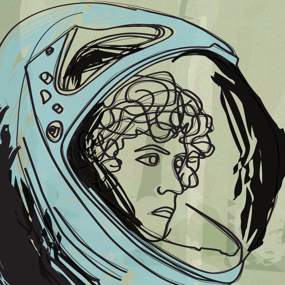
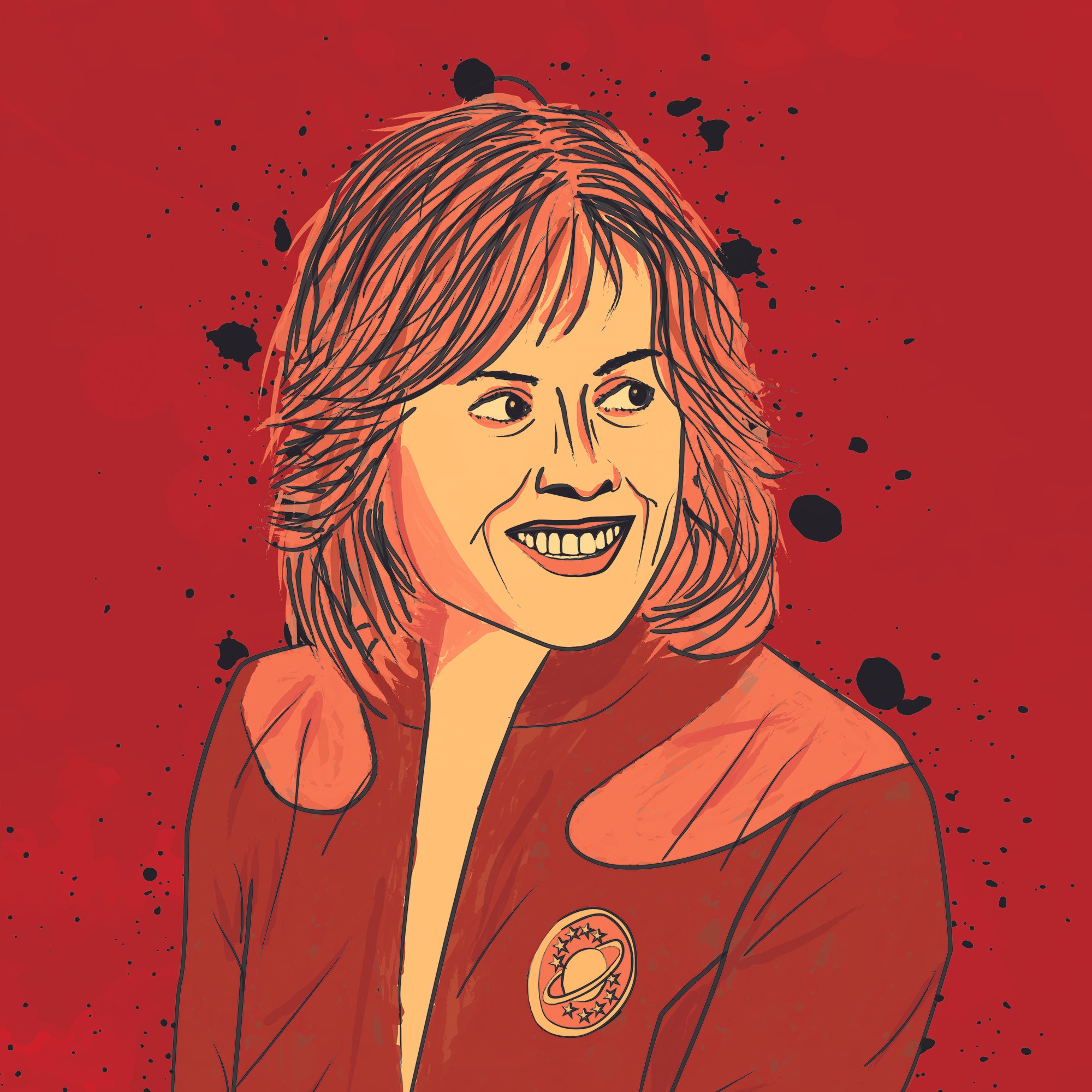
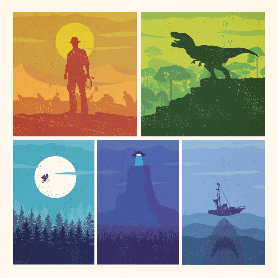
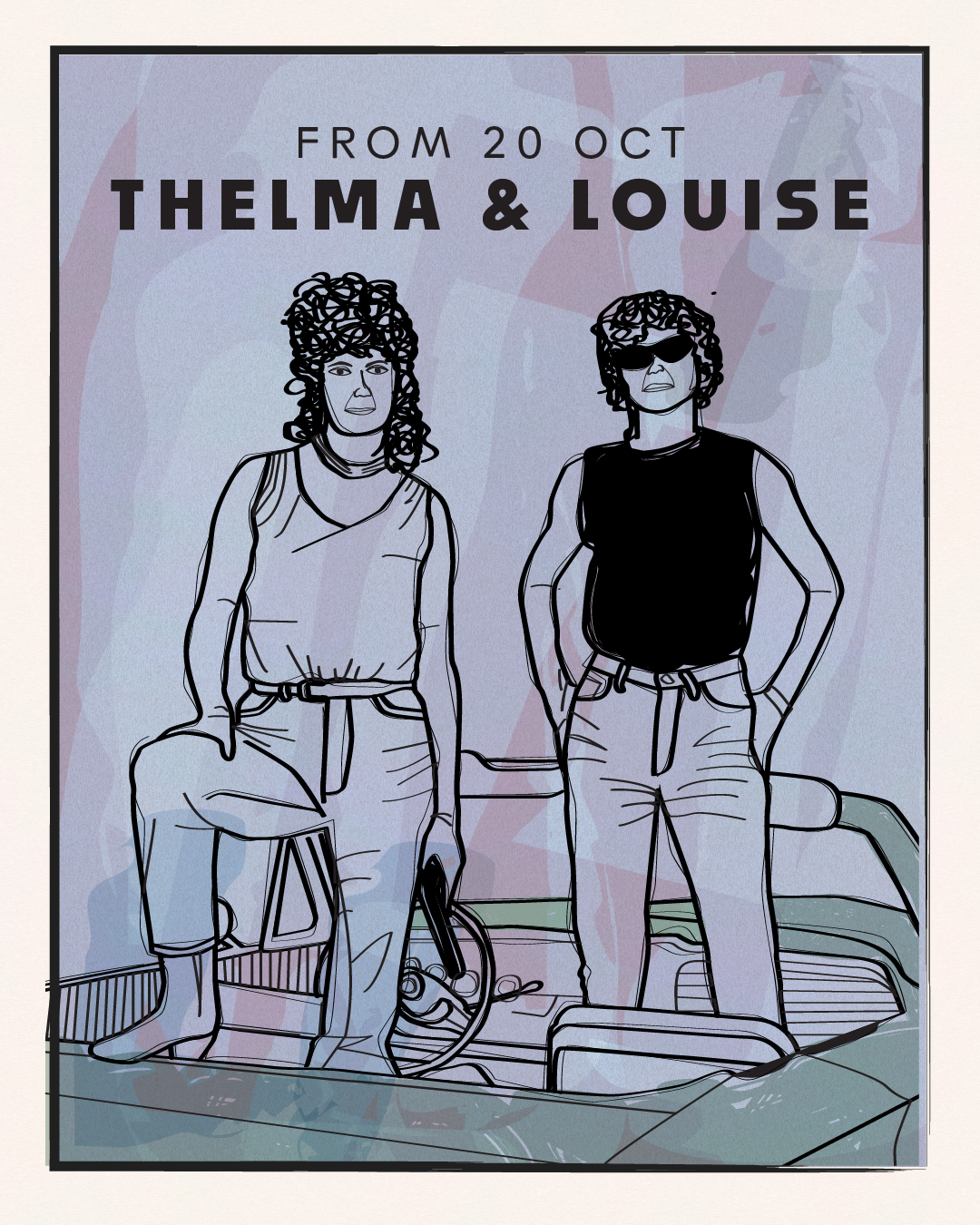
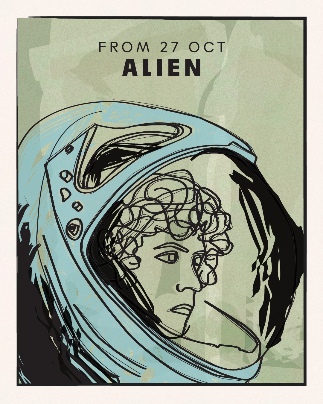
At The Light, I have been fortunate to design campaigns for a range of film seasons that celebrate classic films on the big screen. These curated seasons offer audiences a more diverse programme, while helping to drive attendance during quieter periods.
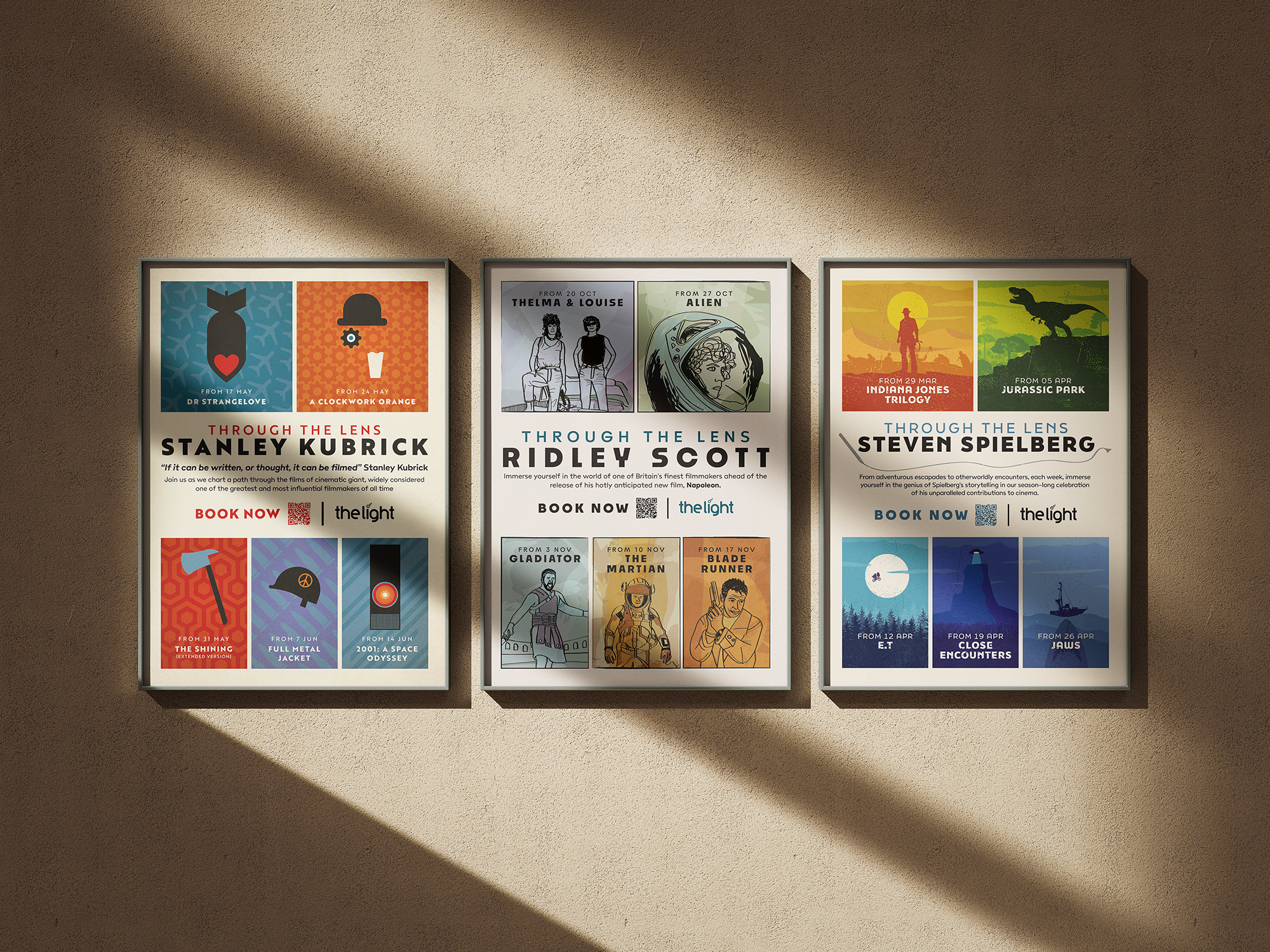
Each campaign has its own distinct visual identity, carefully curated to reflect the tone, era, and cinematic style of the featured films, directors, or actors. The result is a series of engaging campaigns that connect with audiences.
Ridley Scott Season
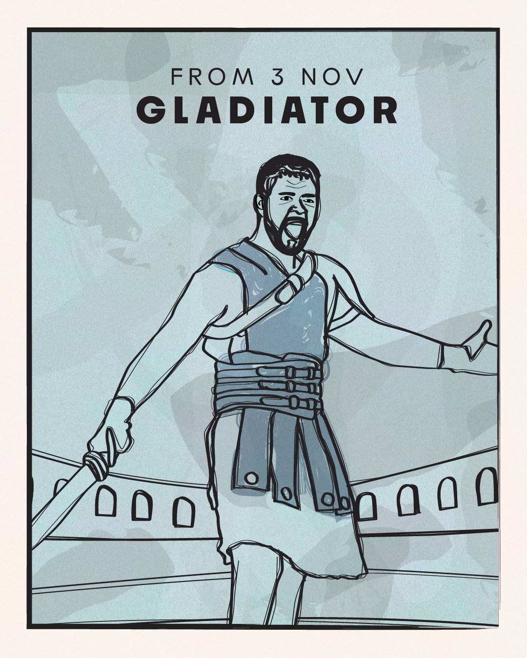
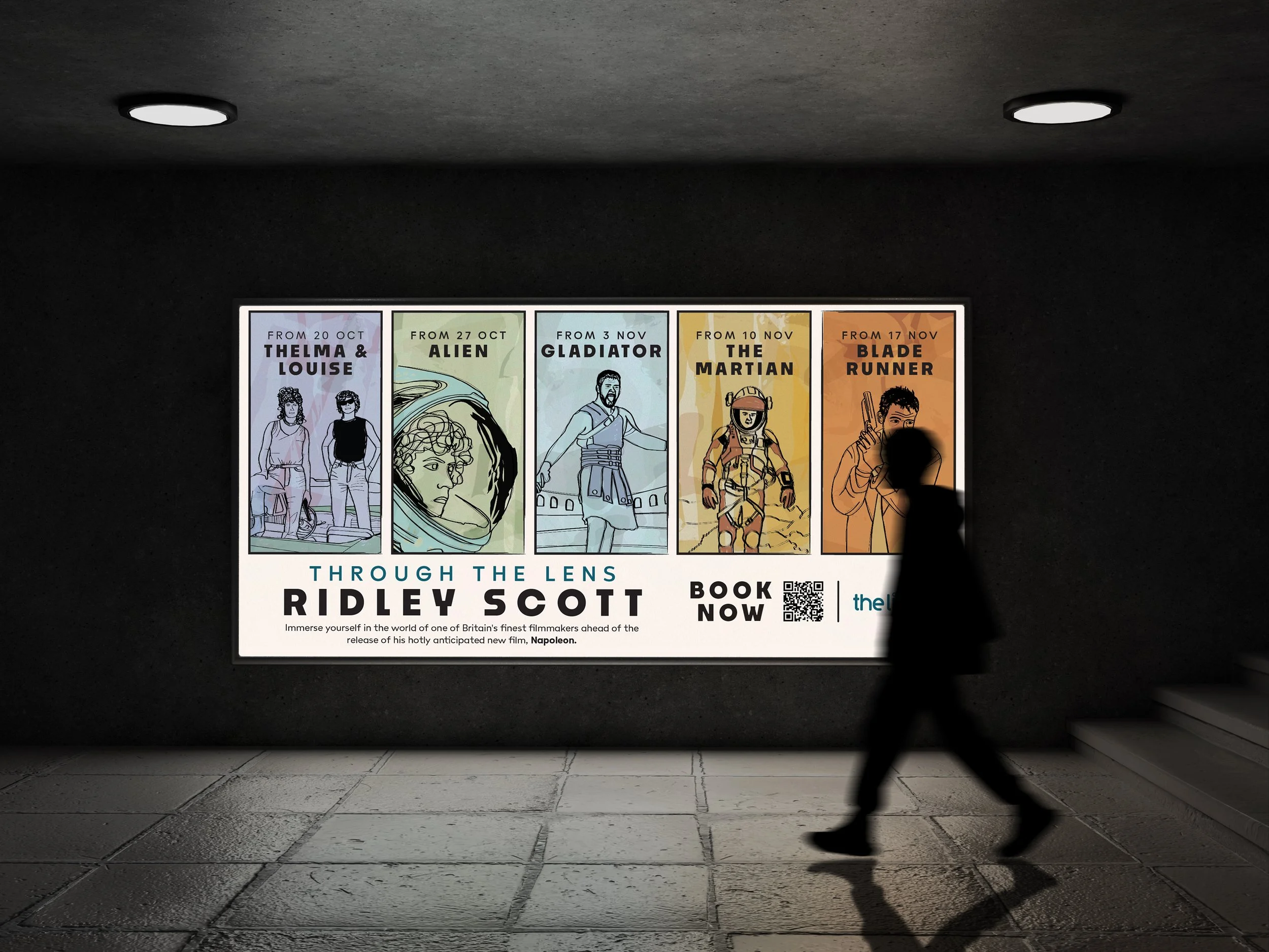
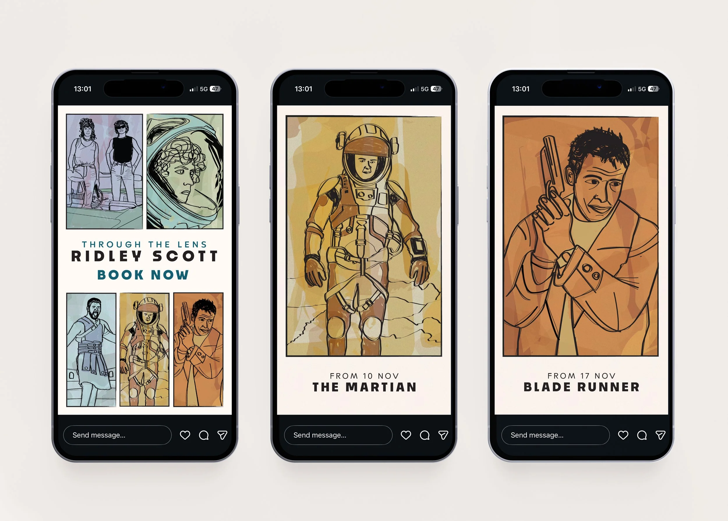
The visual identity for this film season was inspired by Ridley Scott's bold cinematic style and the creativity of fan art. Hand-drawn ink illustrations were created to reimagine iconic moments from each film, resulting in a distinctive aesthetic that reflected the atmosphere, scale, and visual language of his work.
This was the first illustrated film season produced at The Light and it proved to be an overwhelming success. The campaign became the company's most successful film season to date, resonated strongly with audiences, and paved the way for many more illustrated film seasons. As a memorable highlight, Ridley Scott himself requested copies of the artwork, and I was fortunate enough to receive a signed print back from him!
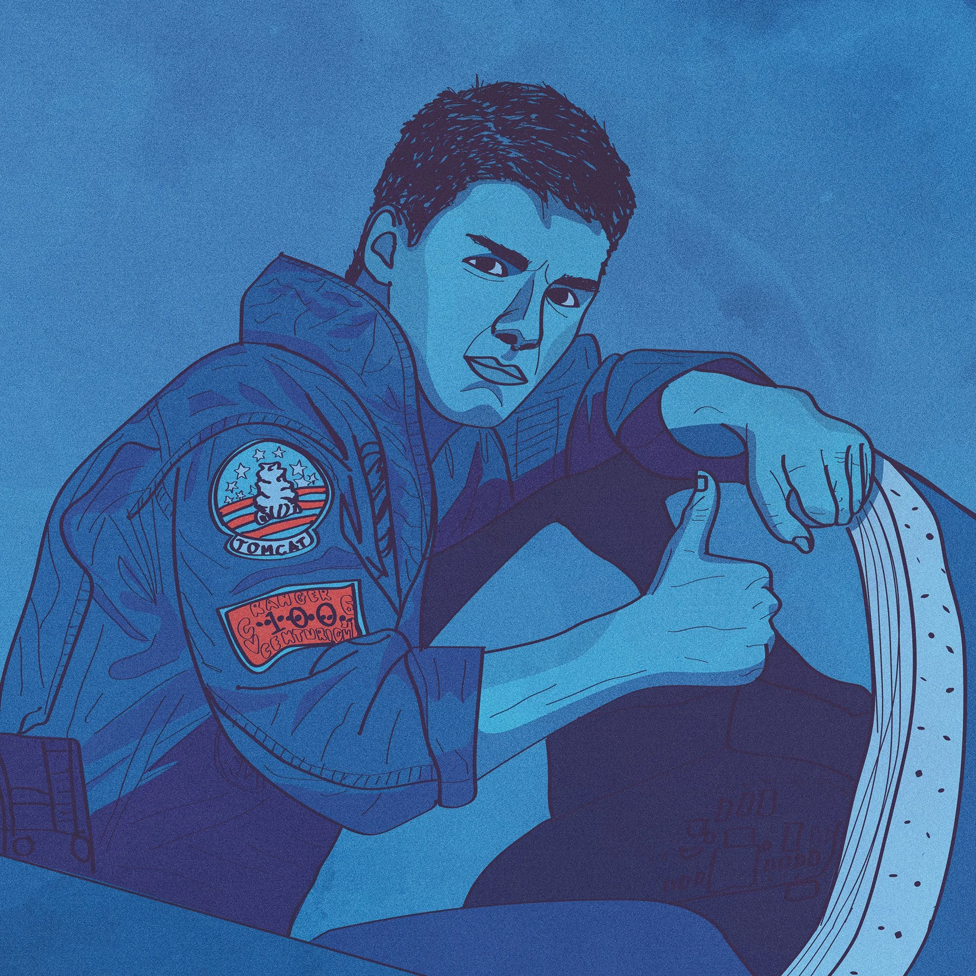
Tom Cruise Season
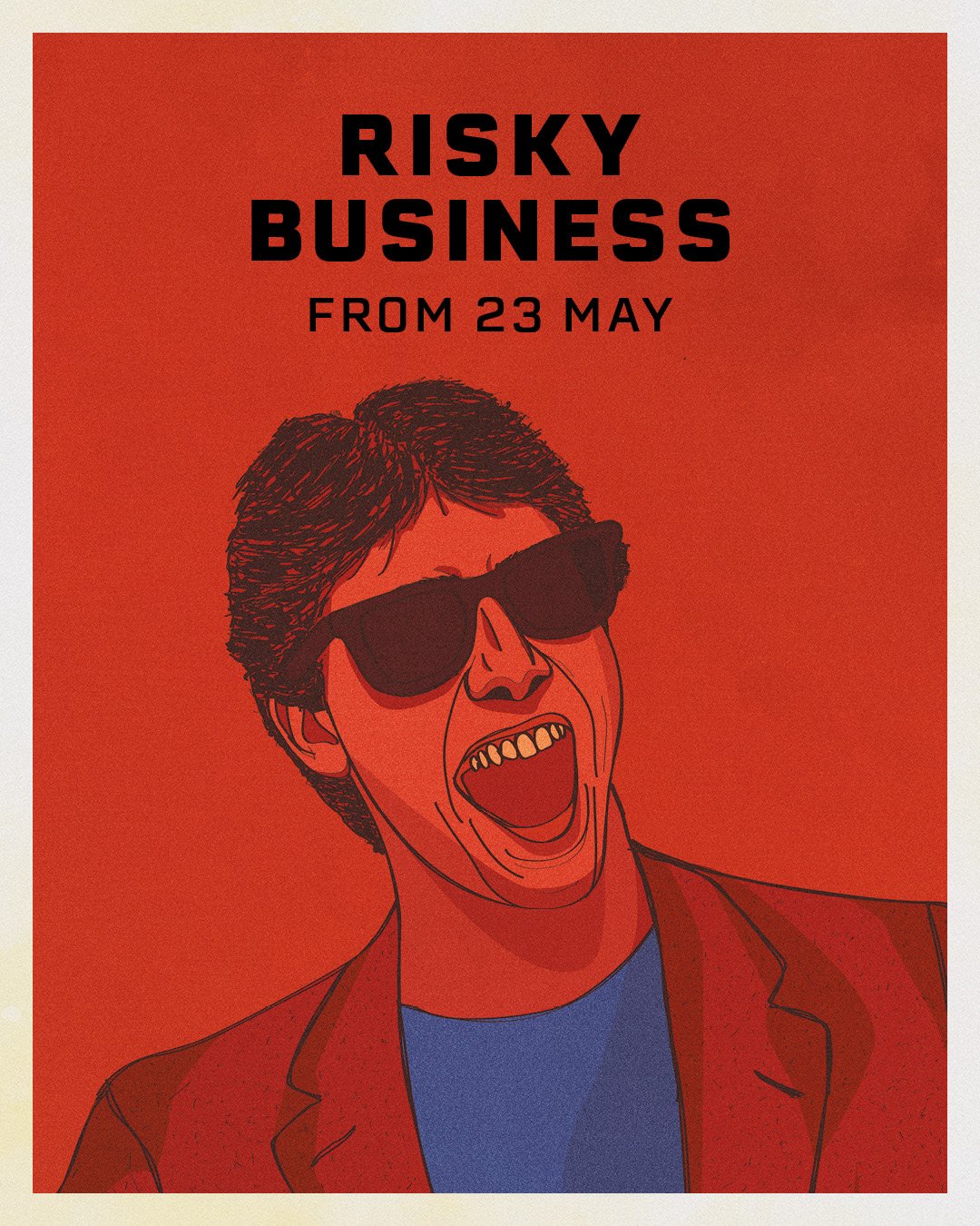
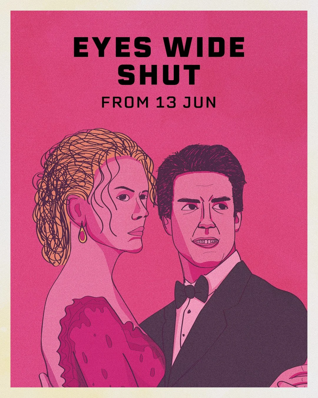
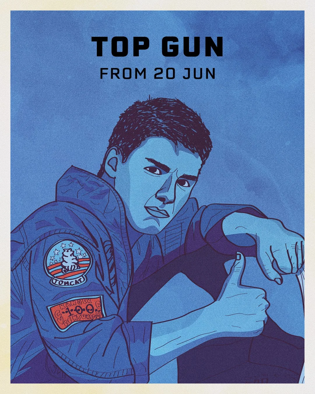
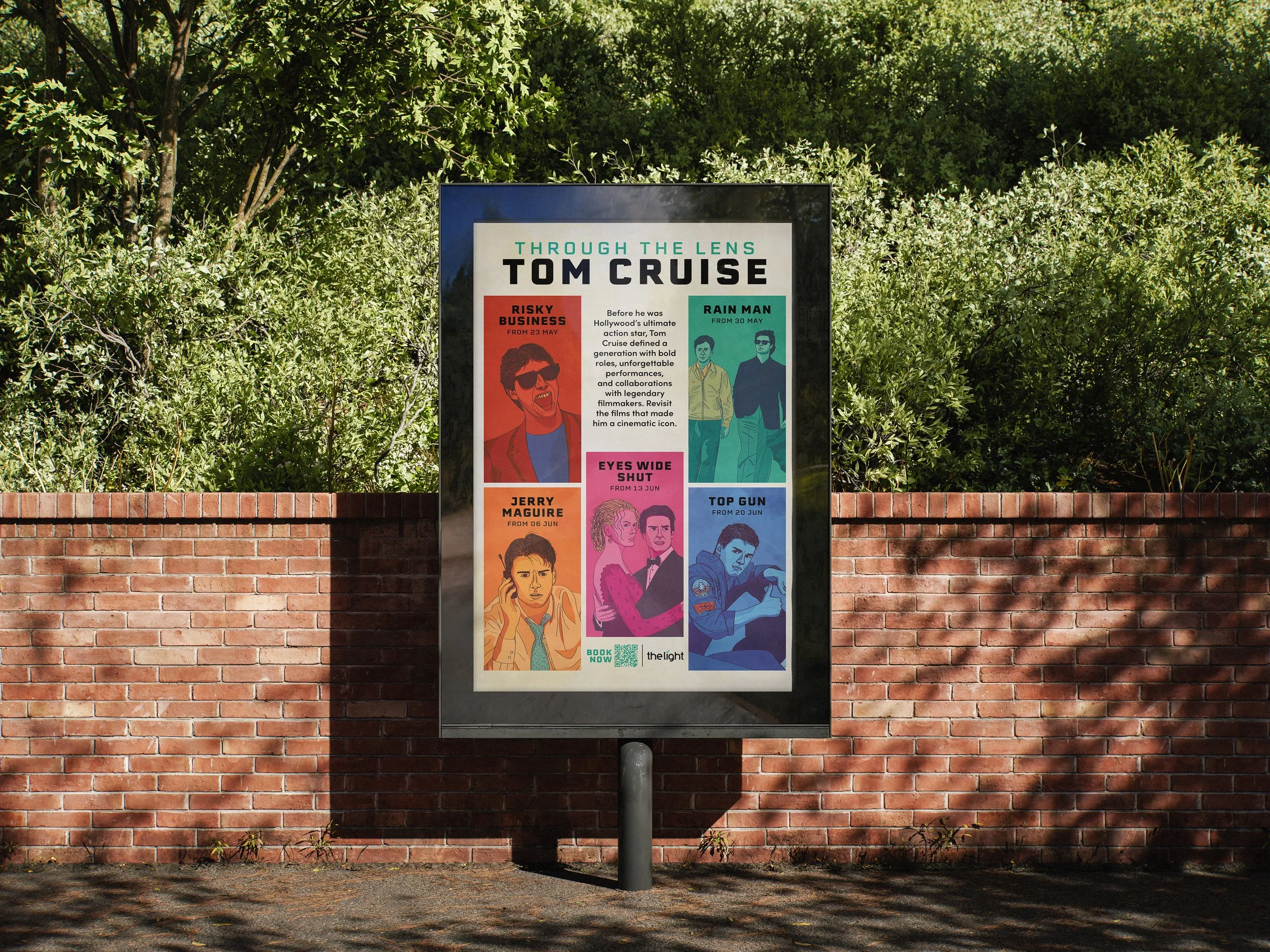
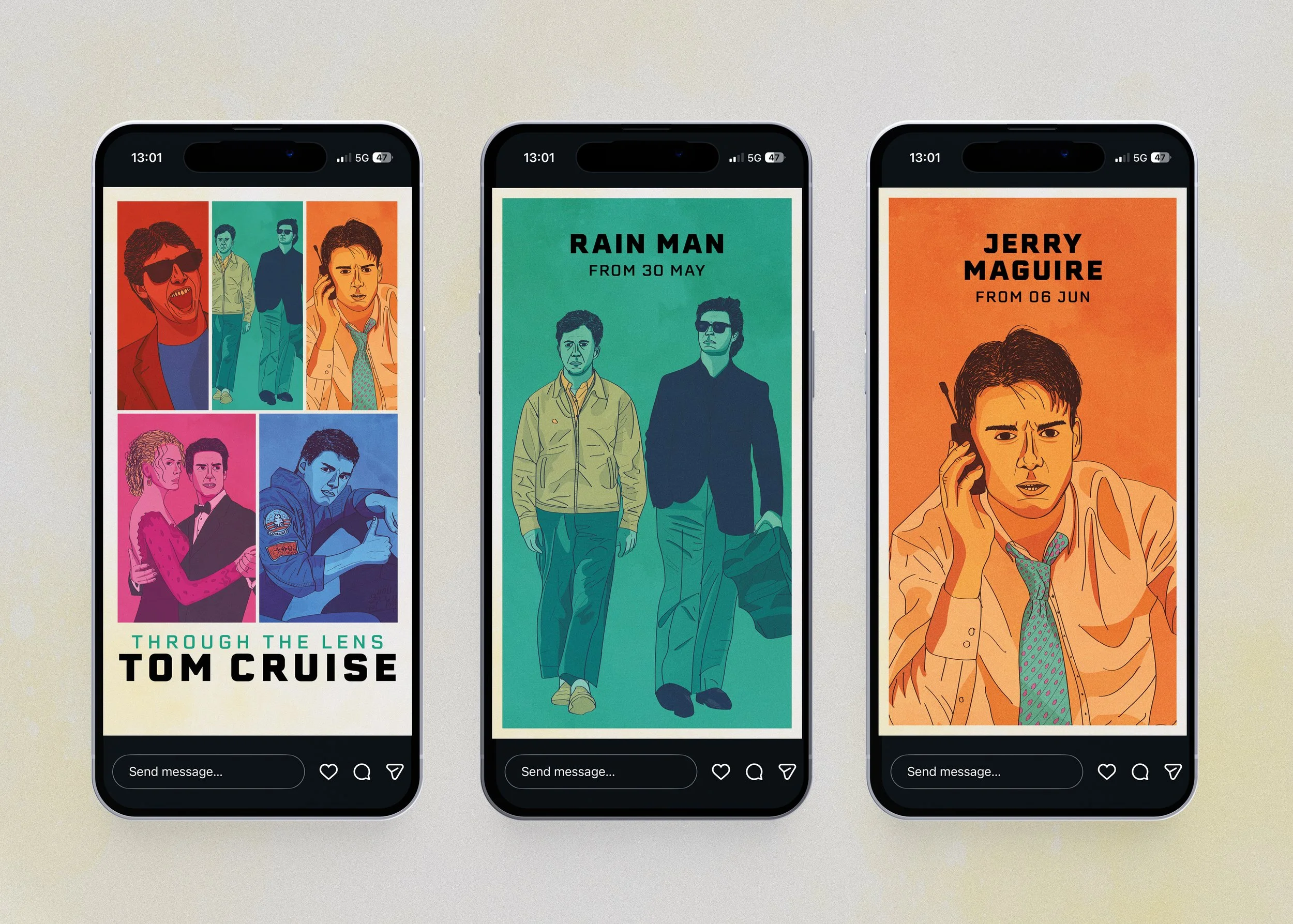
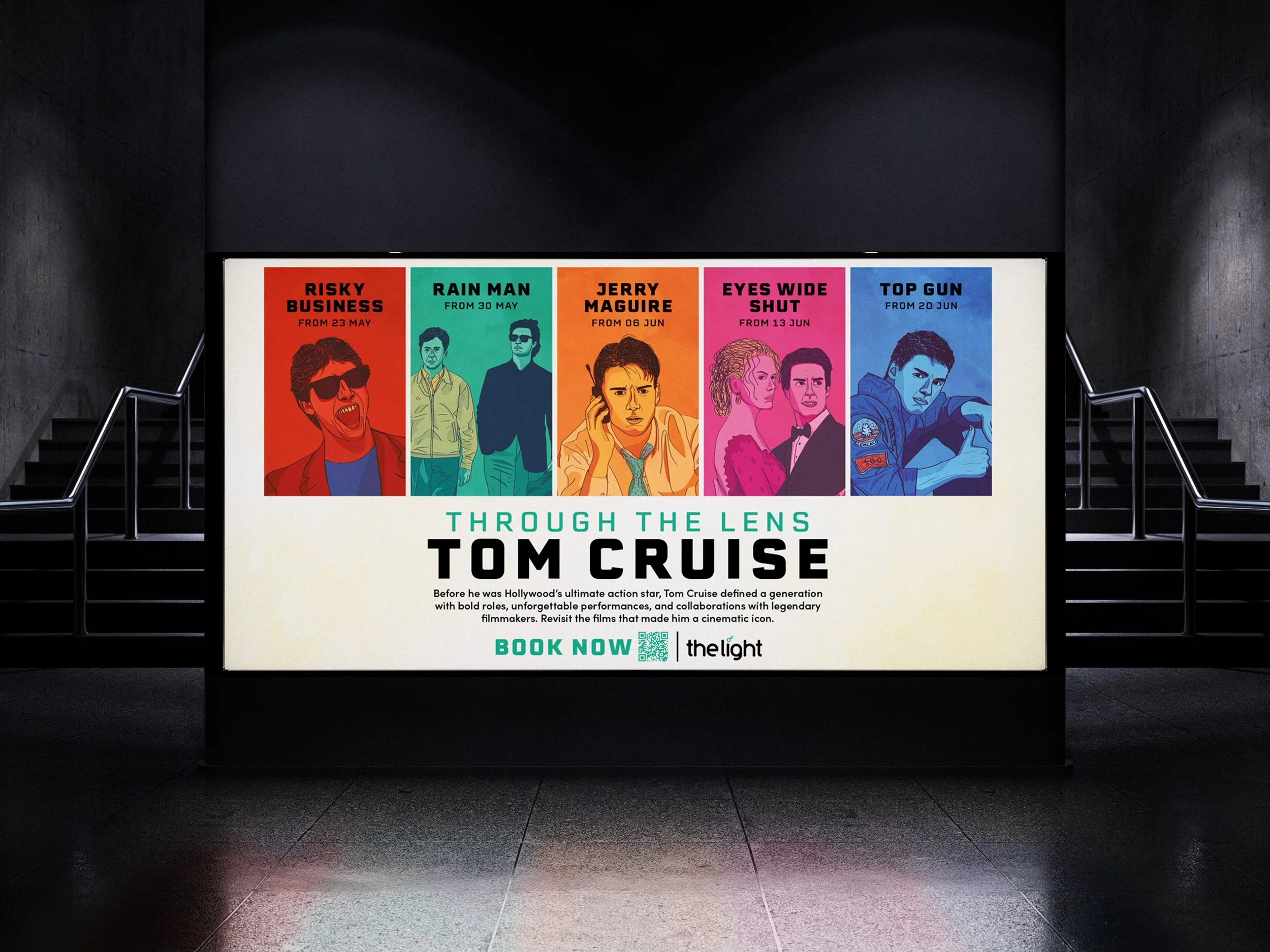
In this film season, I wanted to capture the retro energy, fun, and iconic status of both the featured films and Tom Cruise's career. The illustration style and colour palette were inspired by the bold aesthetics of the era, creating a nostalgic visual identity that was carried through the campaign, including the accompanying trailer.
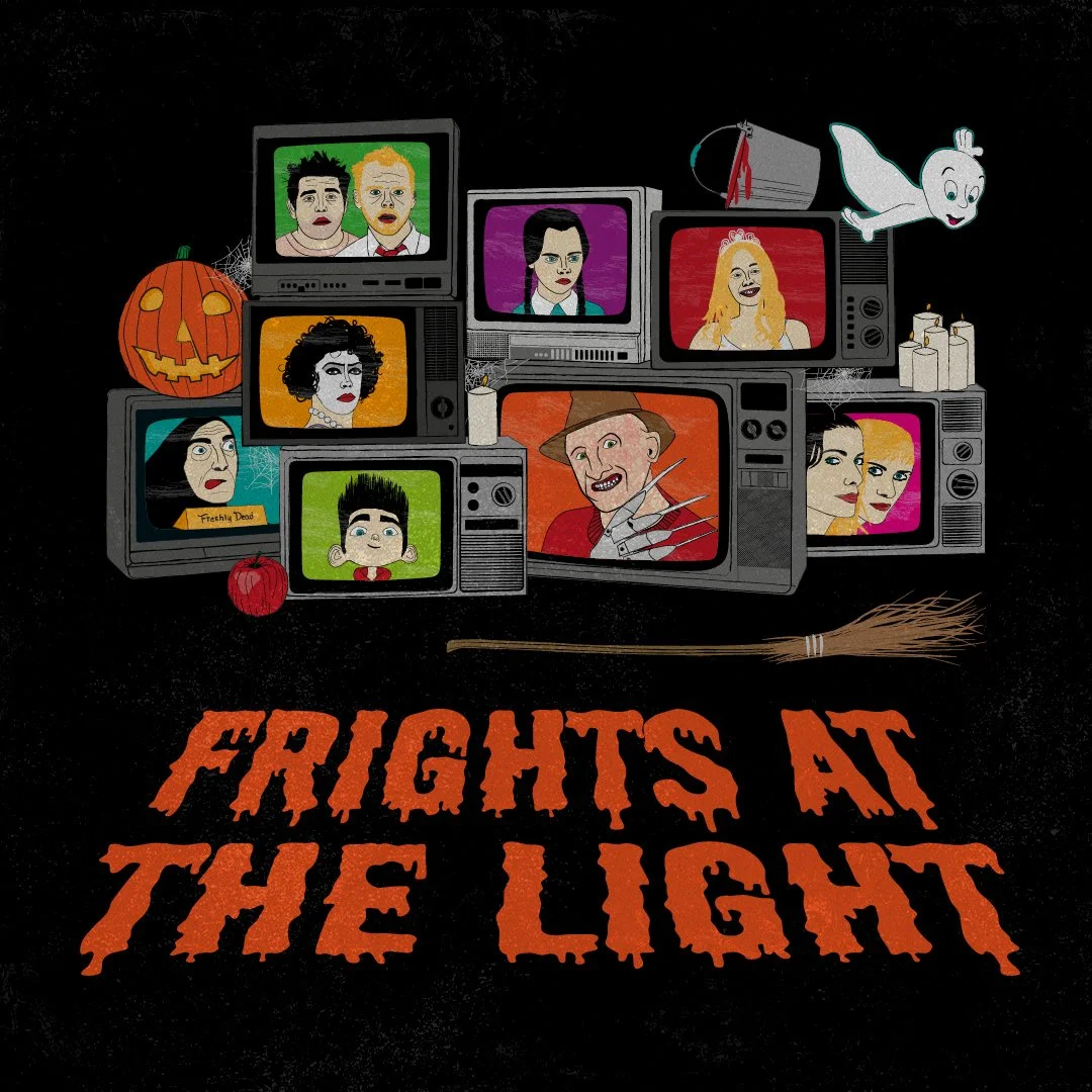
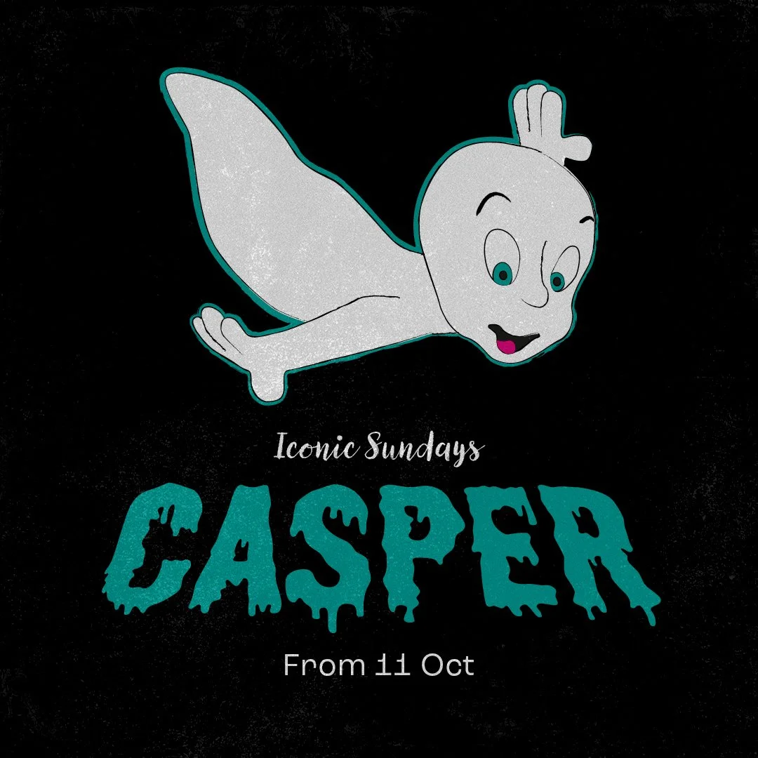
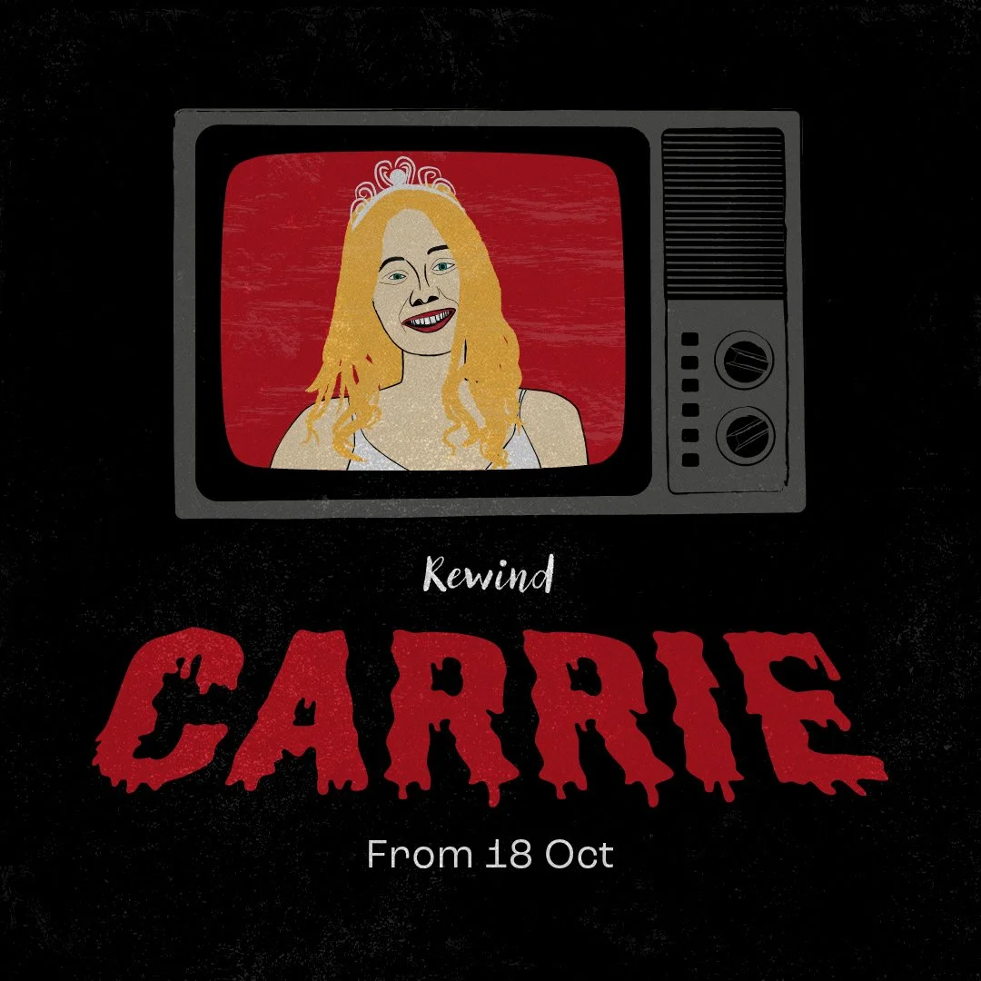
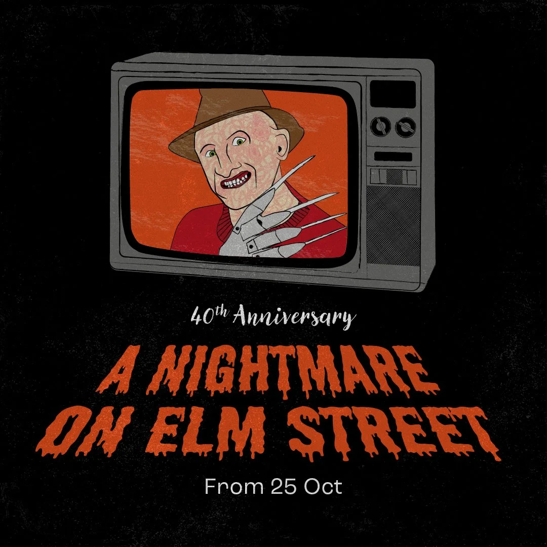
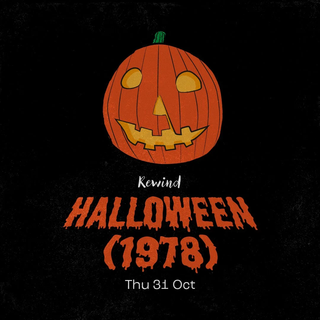
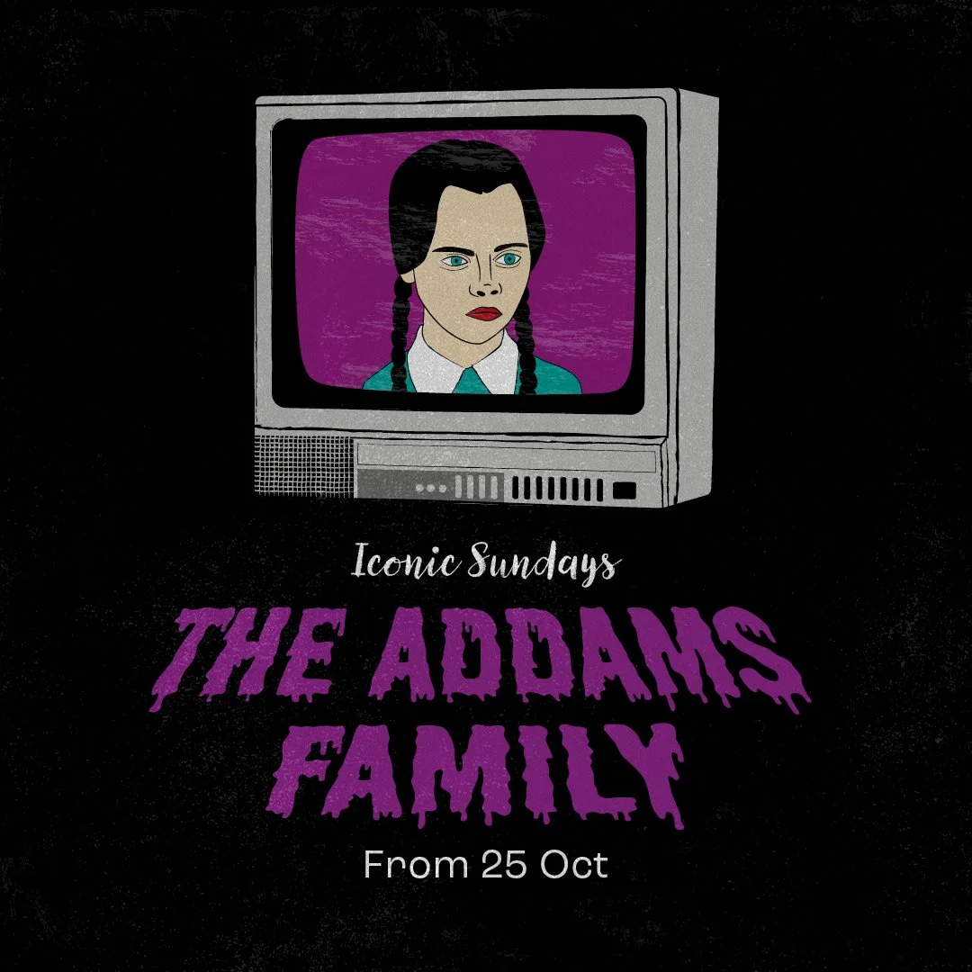
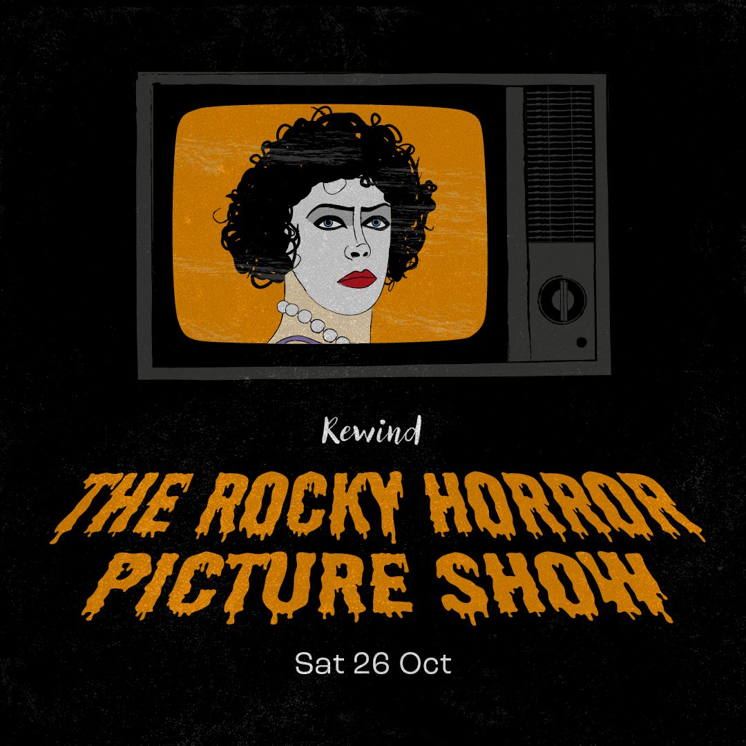
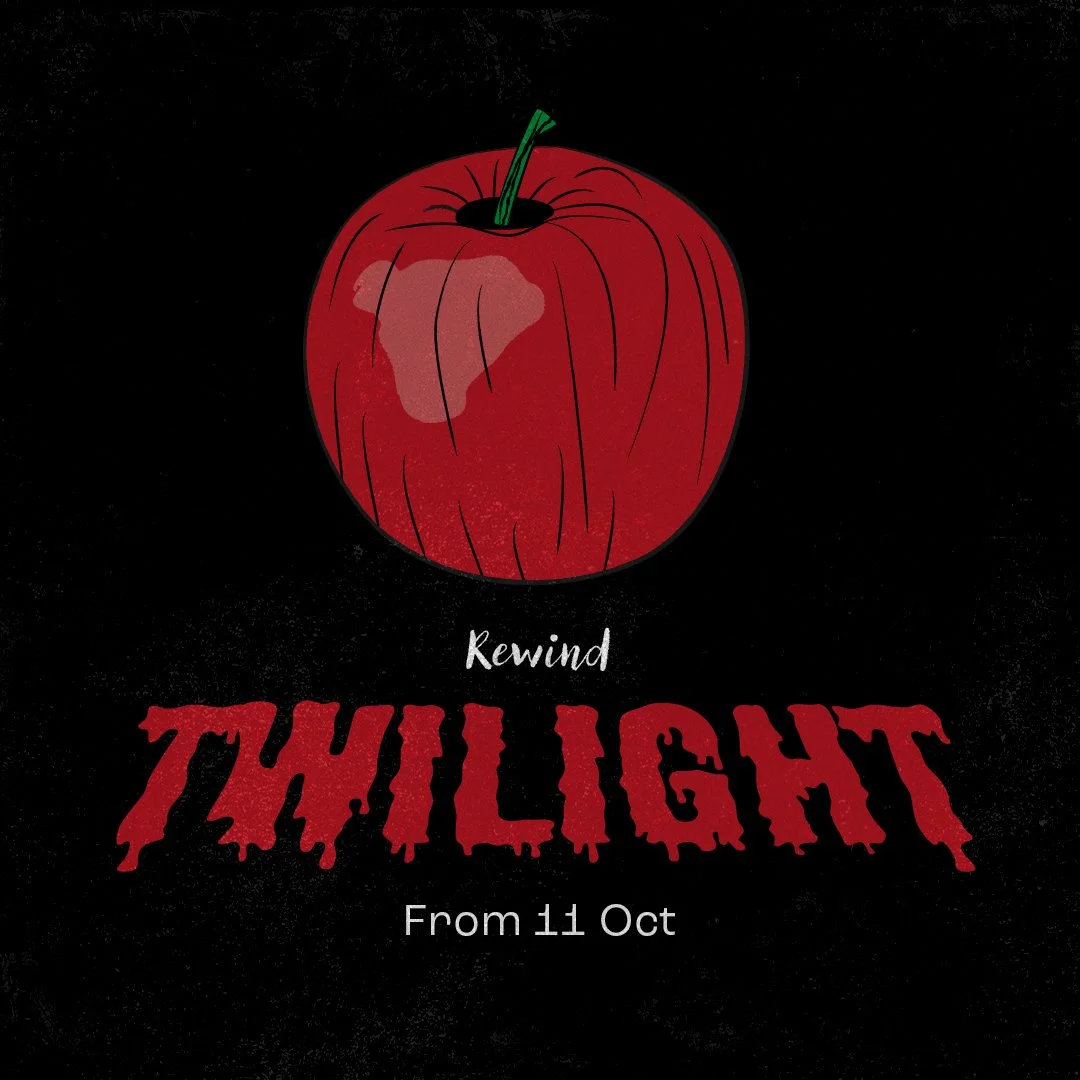
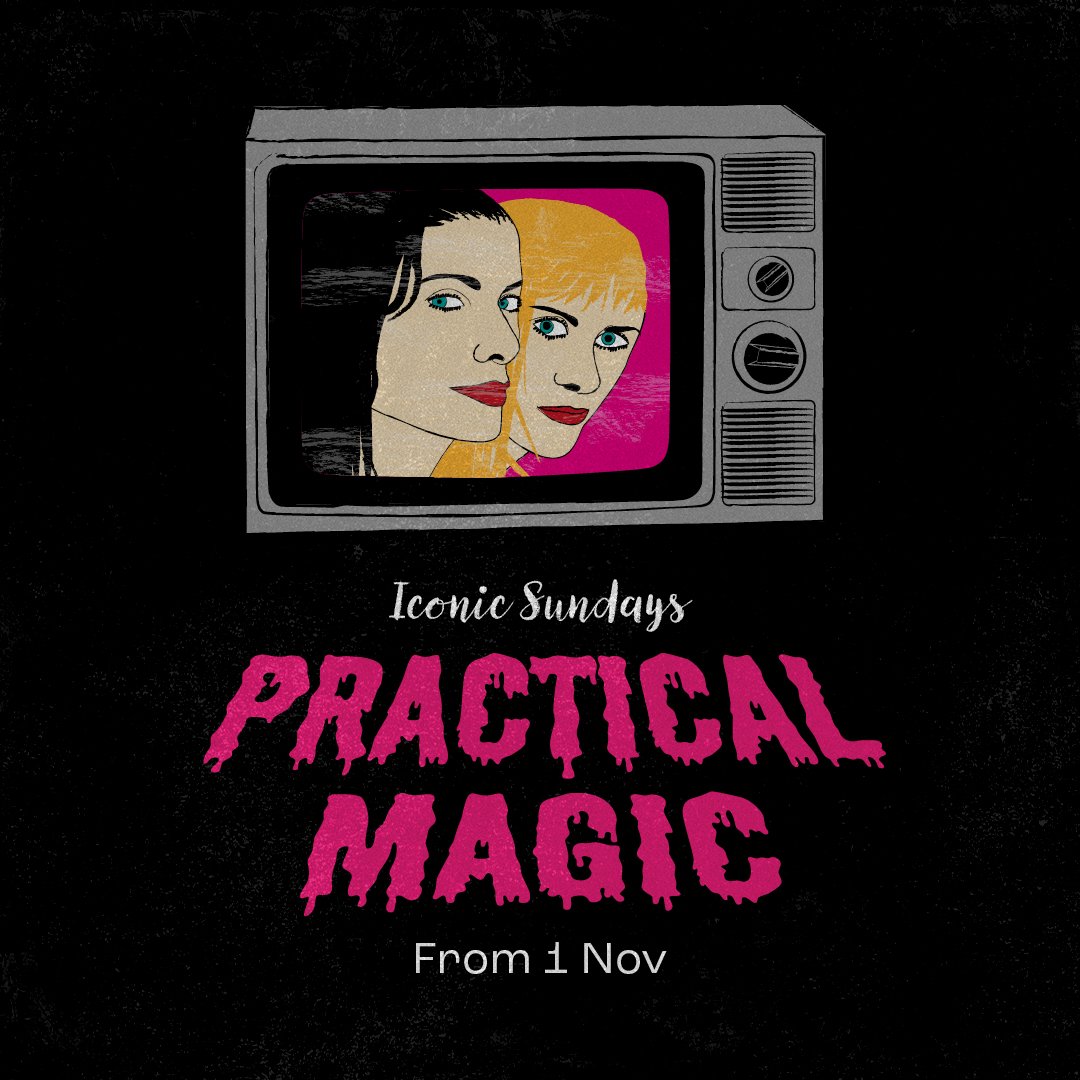
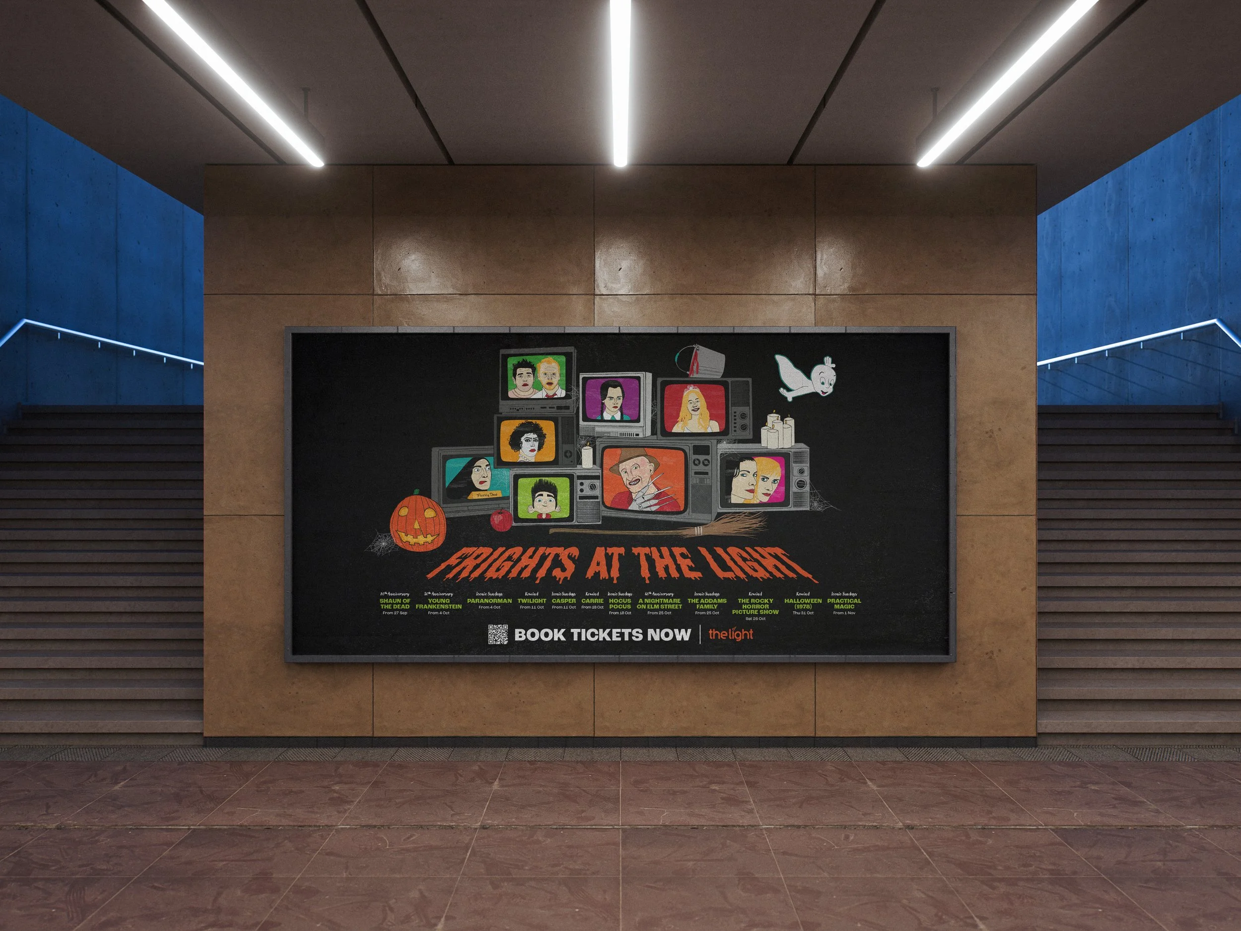
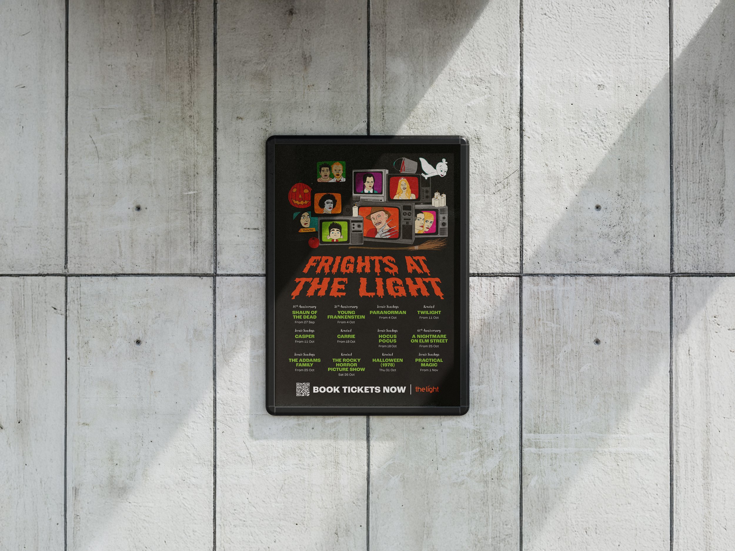
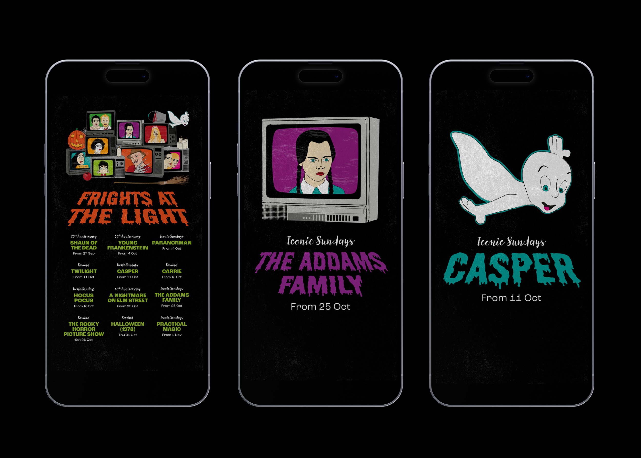
Frights at the Light
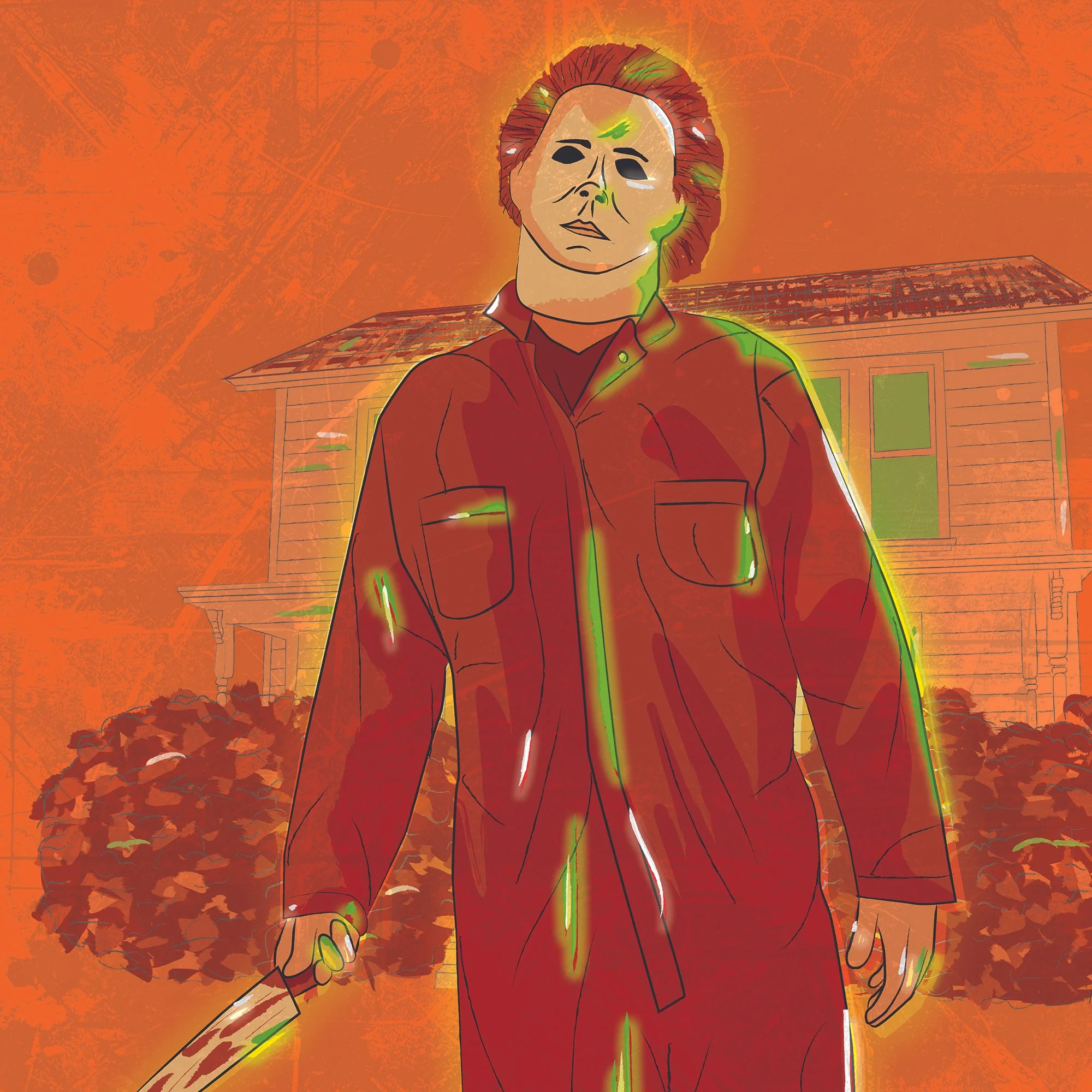
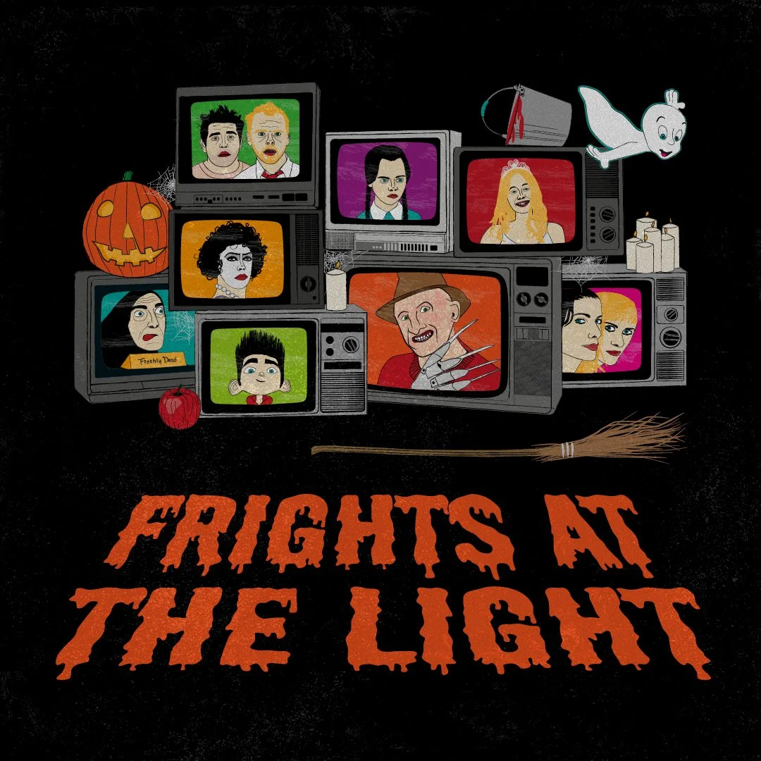
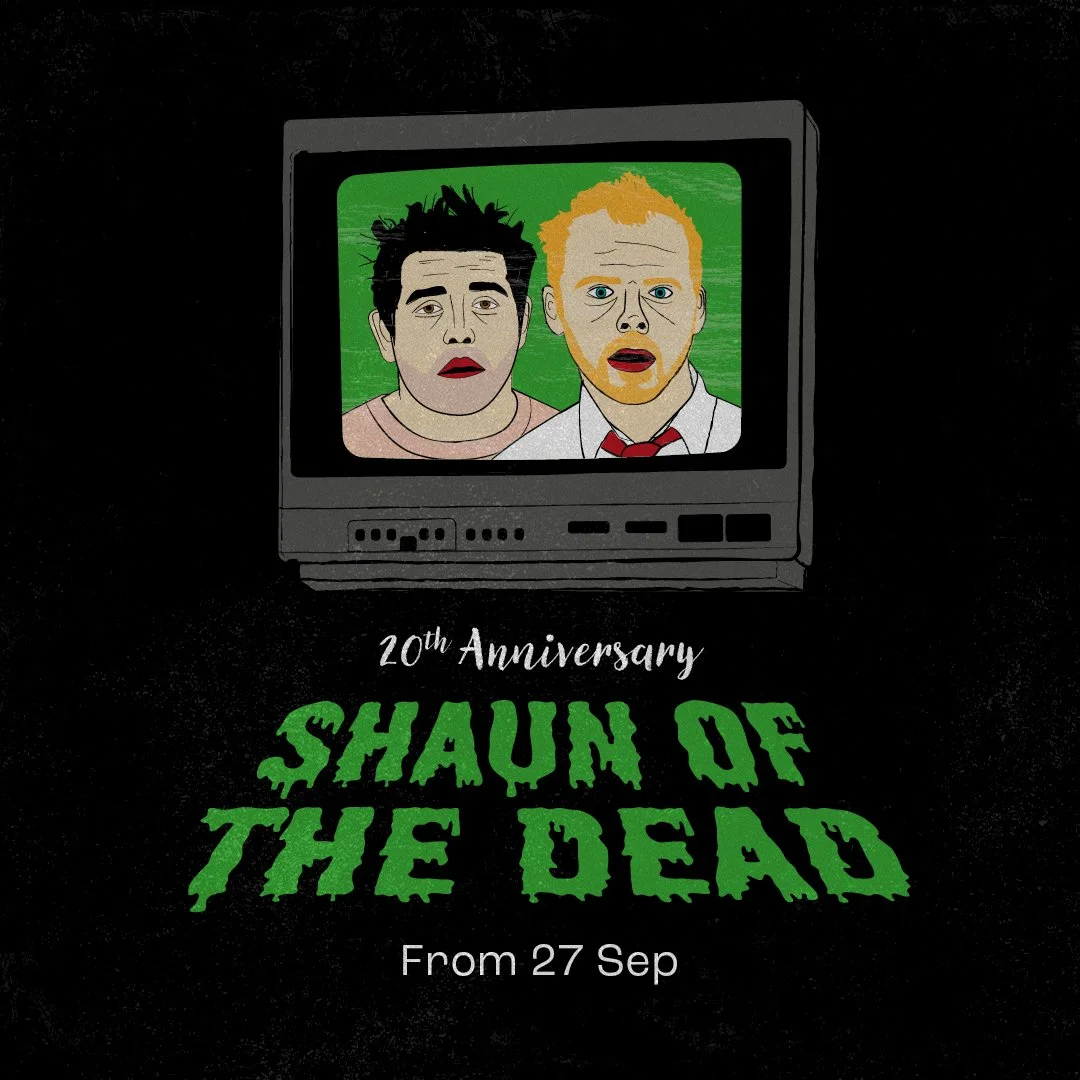
For this Halloween film season, I developed the concept of using vintage televisions to frame illustrations of iconic horror characters from the featured films. The TVs created a bold, recognisable device for showcasing the line-up while also referencing the VHS era, where many of these classics first became cult favourites.
The hand-drawn illustration style and bold colour palette were designed to evoke the nostalgia of classic horror, creating a sense of suspense while capturing the genre's distinctive visual identity and appealing to both long-term fans and new audiences.
MyLight Premiere
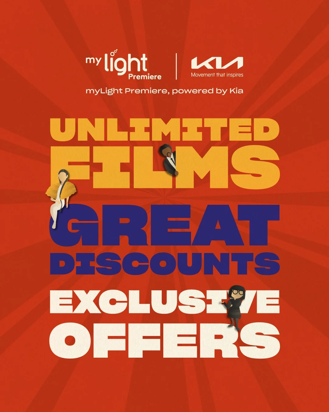
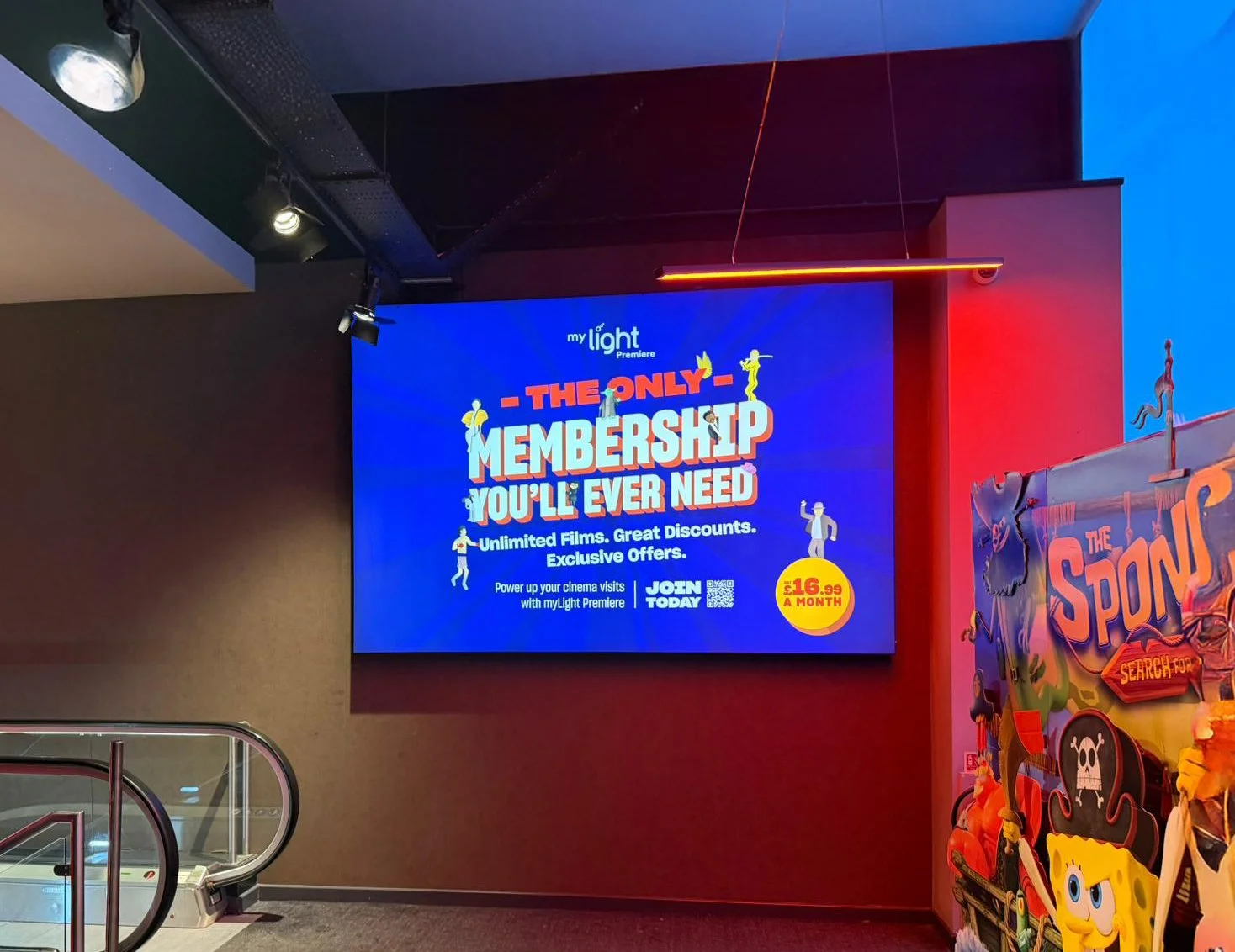
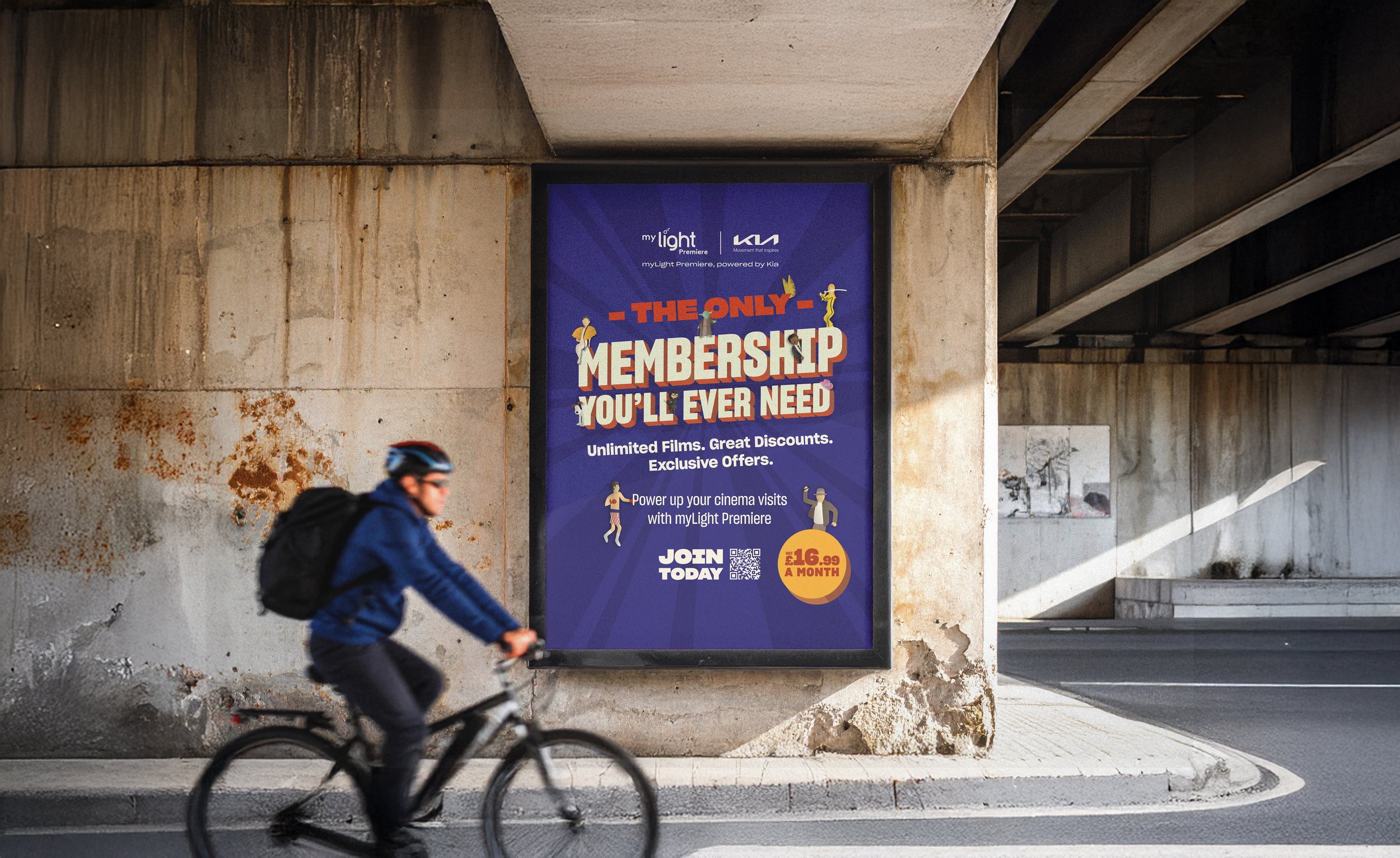
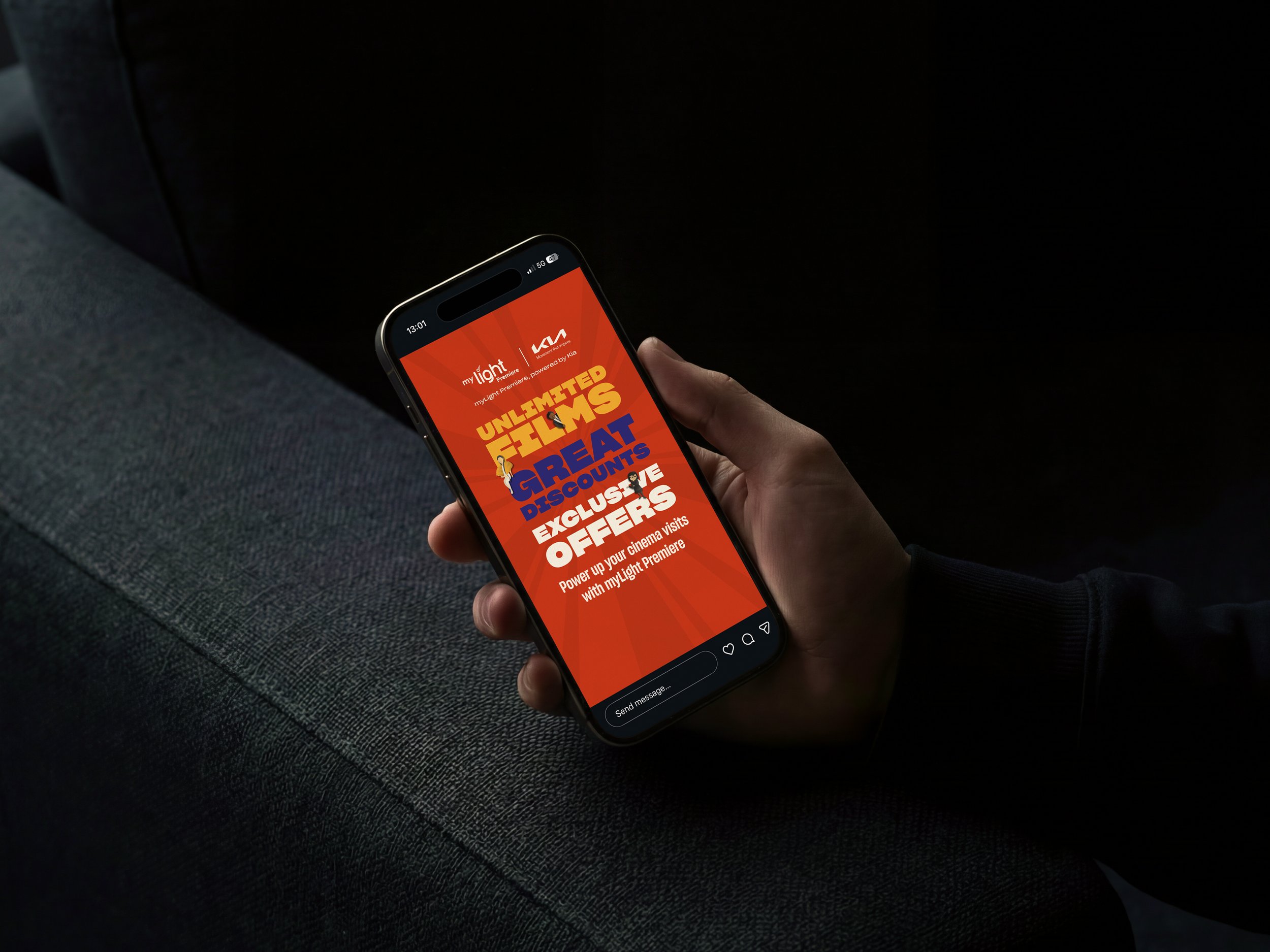
For this campaign, I developed the concept of using illustrations of iconic film characters interacting with the bold 3D typography to draw attention to the membership offer and create a playful, eye-catching visual identity. The bright, vibrant colour palette was designed as a flexible system, allowing different colour combinations to be mixed and matched while maintaining a cohesive look across every campaign touchpoint.
The identity proved so successful that it was adopted across The Light's wider cinema marketing, creating a consistent and recognisable visual language for future campaigns.
Since its launch in March 2024, membership has grown significantly, increasing from 16,435 to 23,651 which has exceeded expectations.