The Light: Food & Drink
Food & Drink is a key part of The Light’s offering, both as an important revenue stream and as a point of difference from competitors. With a wide range of food and drink, from burgers and pizzas to cocktails and soft drinks, the challenge was to create a visual identity that could showcase the quality and variety of the offering while still feeling distinctly The Light.
Responsibilities
Creative Direction, Branding, Illustration, Menu Design, Print Design
Menu Design System
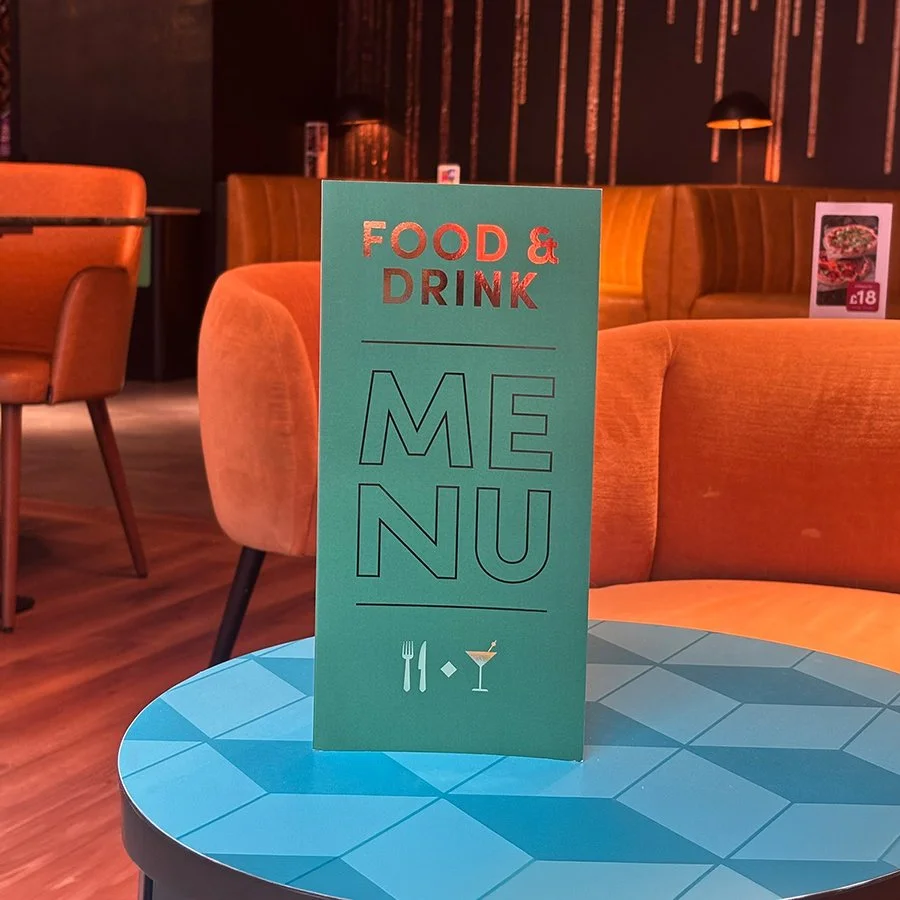
In June 2026, we launched a completely refreshed menu, introducing a new look and feel across the entire Food & Drink offering. The aim was to create a menu that felt fresh and high quality, reflecting the quality of the food itself, while still retaining the fun and approachable personality of The Light.
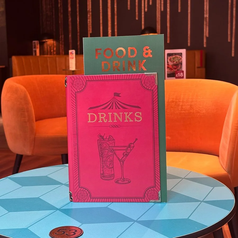
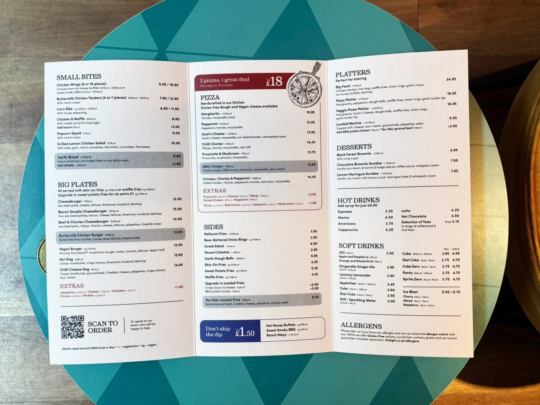
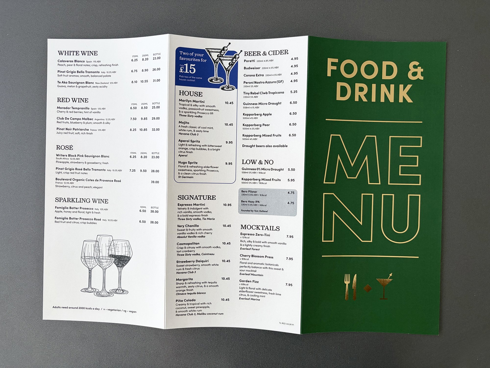
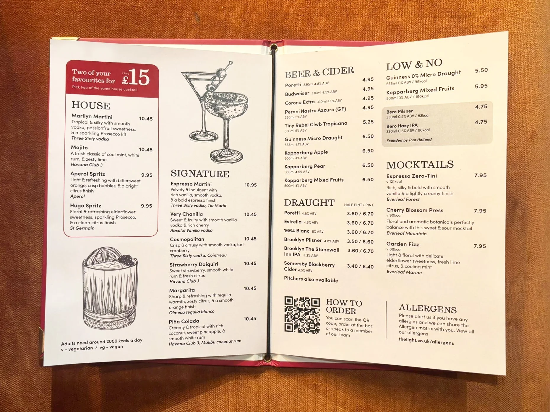
I developed a visual language built around a considered colour palette, characterful serif typography and intricate, hand-drawn illustrations. The illustrations were used throughout the menu to add personality and create an organic, crafted feel, while also helping to bring greater emphasis to key sections and offers. Coloured offer boxes were introduced to clearly group the contents of each deal, making the menus easier to navigate while drawing attention to key revenue drivers. Every element was considered with the customer experience in mind, from the hierarchy and typography through to the colour and illustration style.
The colour palette was chosen to communicate freshness and quality, while the serif typography adds a premium feel without losing the personality and sense of fun associated with The Light. The intricate illustrations complete the look, giving the menus a distinctive, handcrafted quality. The new design system was rolled out across a range of touchpoints, including the main food, drinks, countertop and outdoor menus.
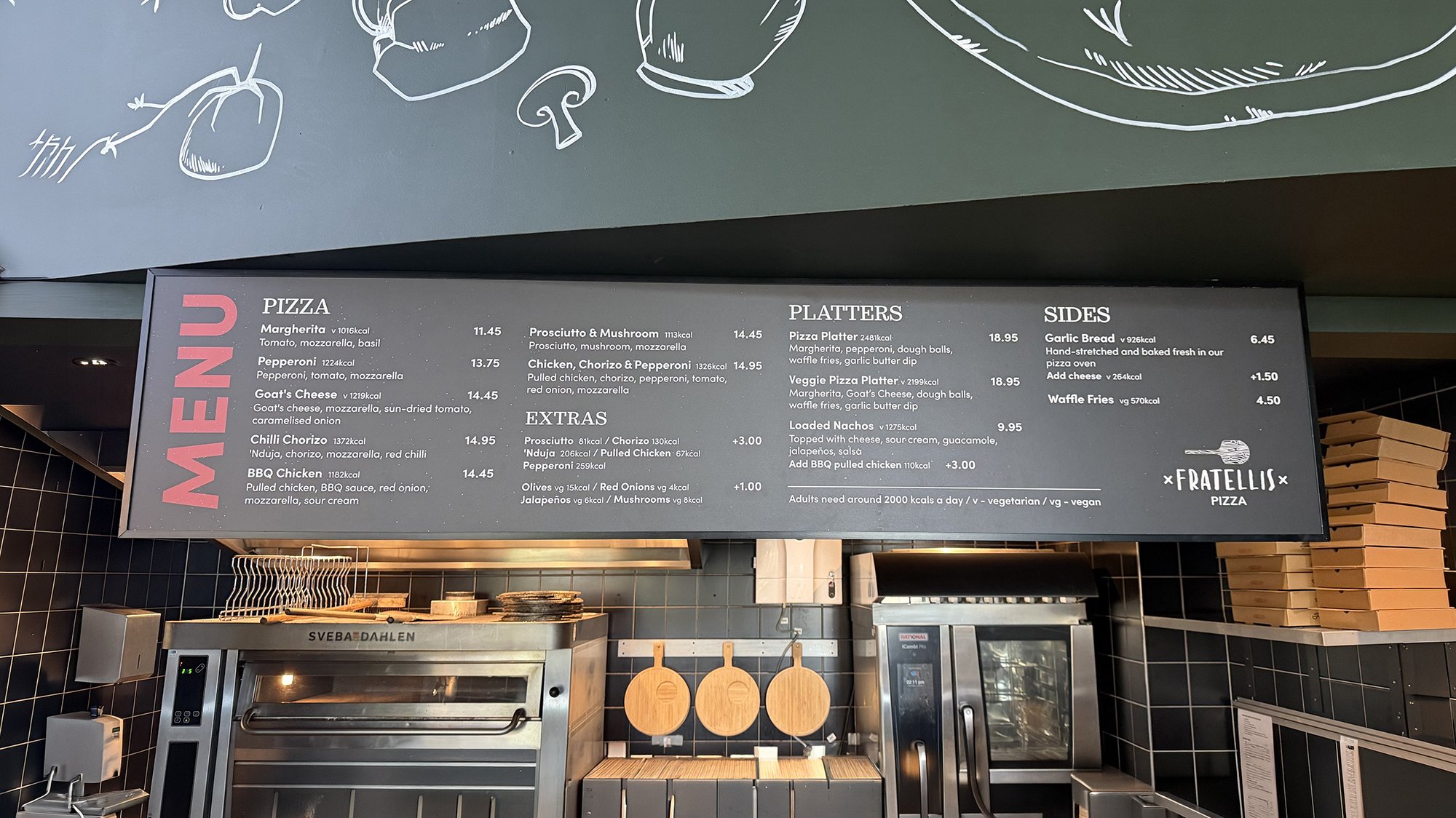
Food & Drink POS
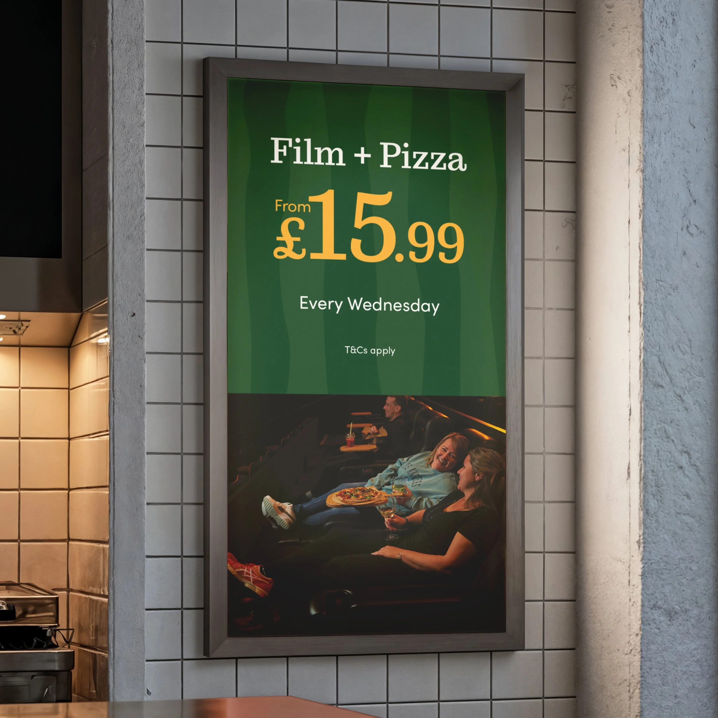
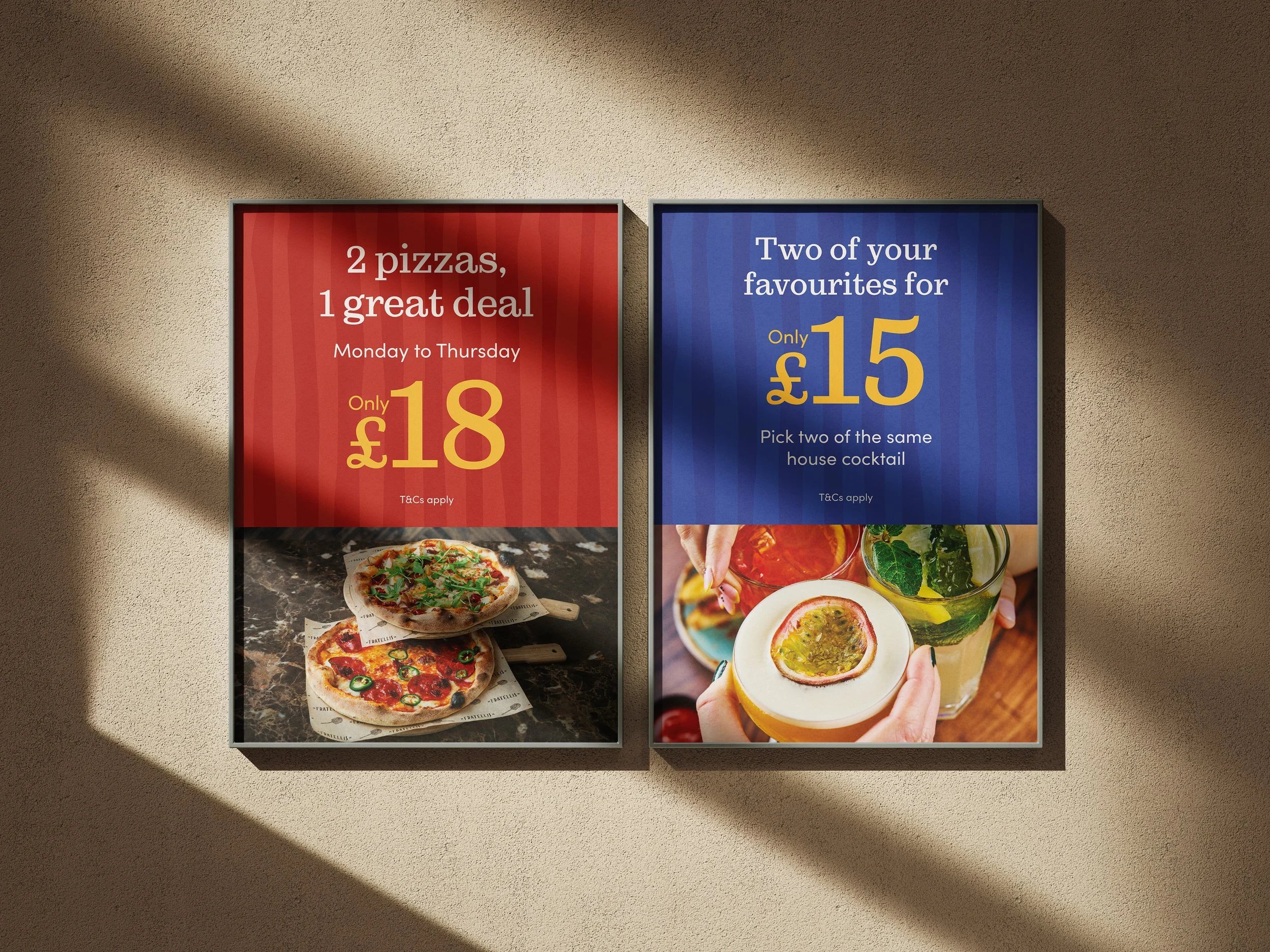
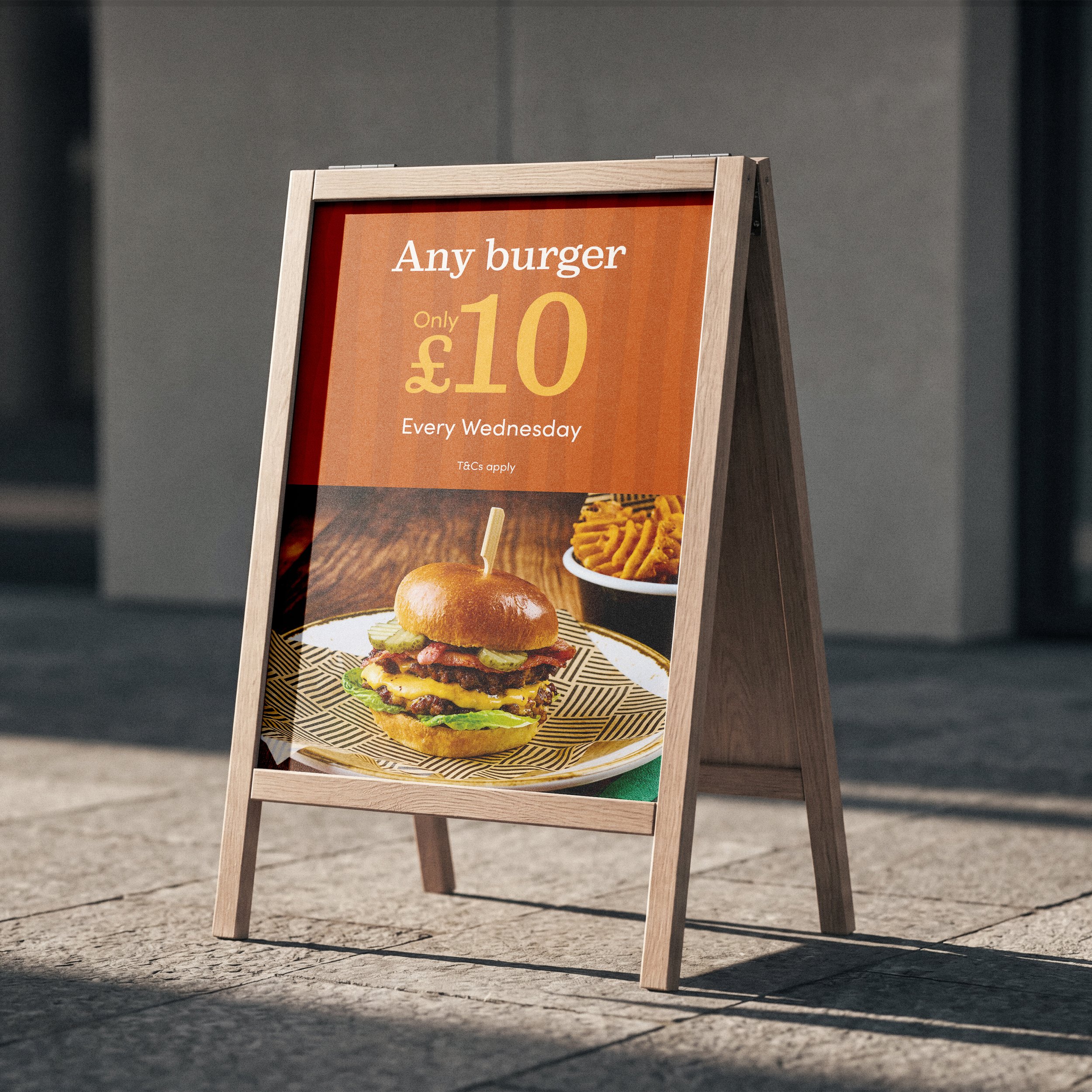
Alongside the menu refresh, I also redesigned the wider Food & Drink point-of-sale materials, creating a consistent visual language across A-boards, posters, digital screens, web and social media.
The flexible colour palette allows different combinations to work together while still feeling part of the same cohesive system. Bold typography, illustrations and photography can be mixed and adapted depending on the offer and format, creating a strong visual presence across both physical and digital touchpoints. Photography was also used strategically to showcase the food and make key offers more enticing, while the combination of bold colour, typography and imagery ensures the POS stands out in the busy cinema and entertainment environments.